Case Study: Connection Matters Counselling
Brand Identity & Digital Experience
The Brief: The "Serious-Fun" Equilibrium
The client, a seasoned therapist with a distinct personal style, needed a brand that didn't feel like a template. We identified a core challenge: how to respect the sober, high-trust visual language of mental health services while reflecting a therapist who is creative and modern.
Strategic Pillars:
Structure Before Style: Establishing a firm typographic grid before introducing playful elements.
Anti-Stock Philosophy: A strict "no cheesy stock photography" rule to ensure the site felt bespoke and human.
The Hybrid Aesthetic: Balancing "Clinical Trust" with "Creative Energy."
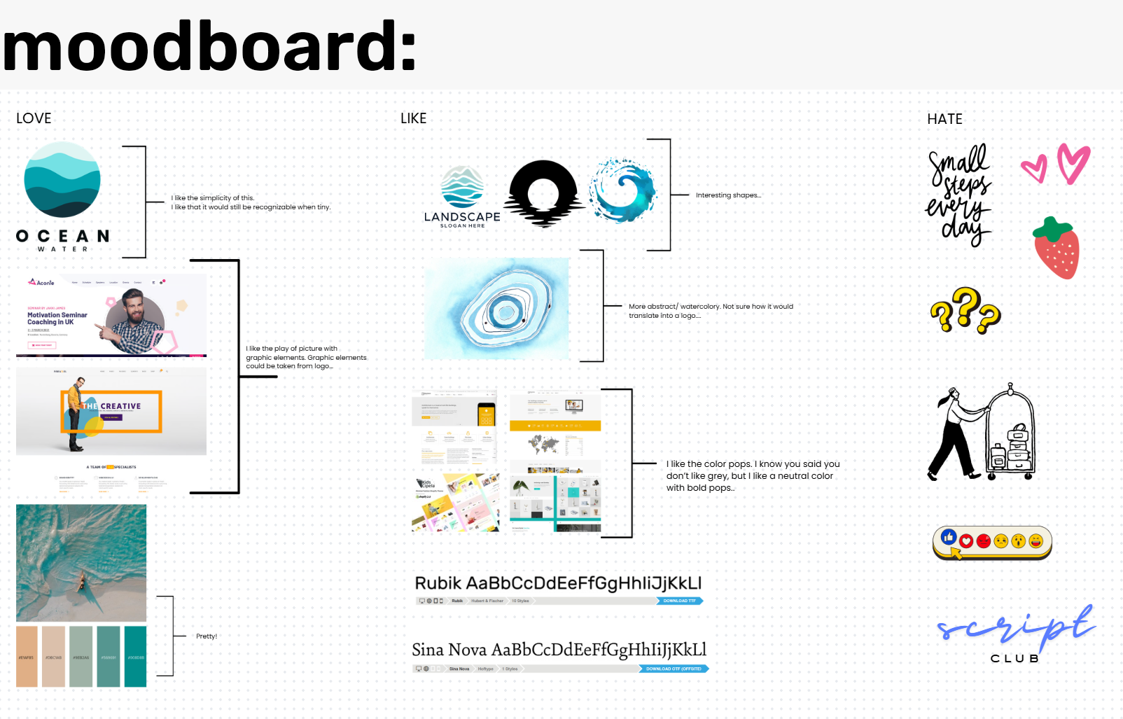
The Process: Collaborative Discovery
The design was born through a highly iterative partnership. By analyzing what the client gravitated toward- and more importantly, what she didn't- we carved out a unique space in a crowded market.
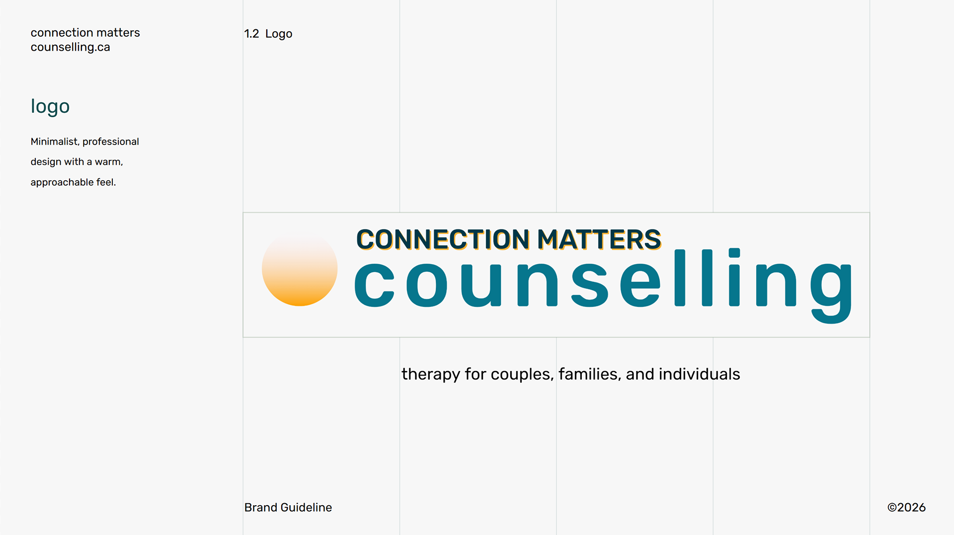
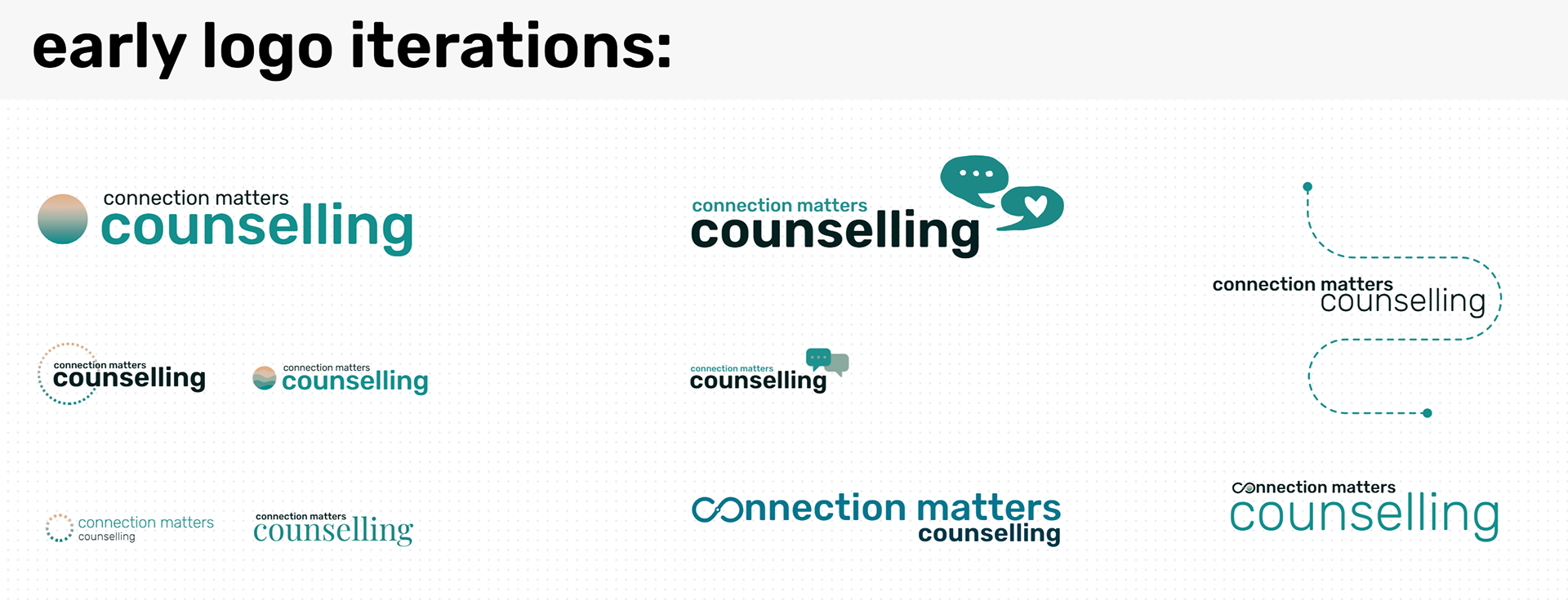
The Logo Evolution:
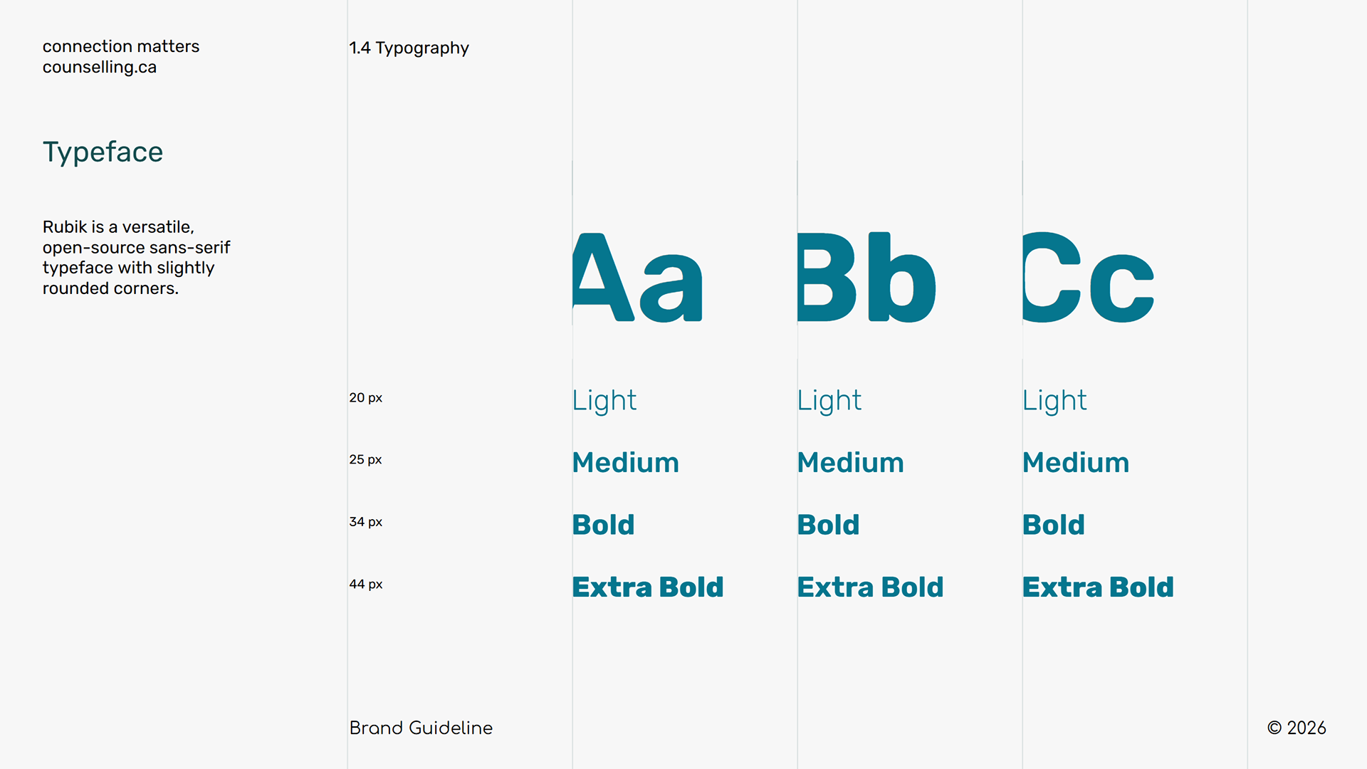
We landed on a minimalist, glowing orb to represent a "safe space" or a spark of insight. I used a rounded, bold sans-serif to keep the brand approachable, while the all-caps "CONNECTION MATTERS" adds the necessary professional weight.
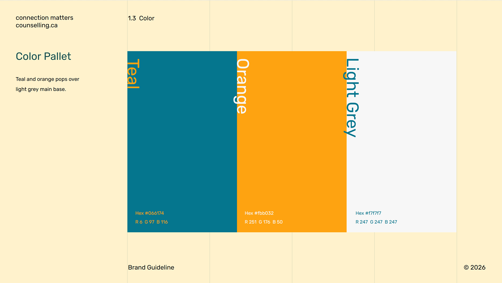
The "Pop" Factor: We integrated an orange offset shadow in the typography—a subtle nod to "vibration" and human energy.
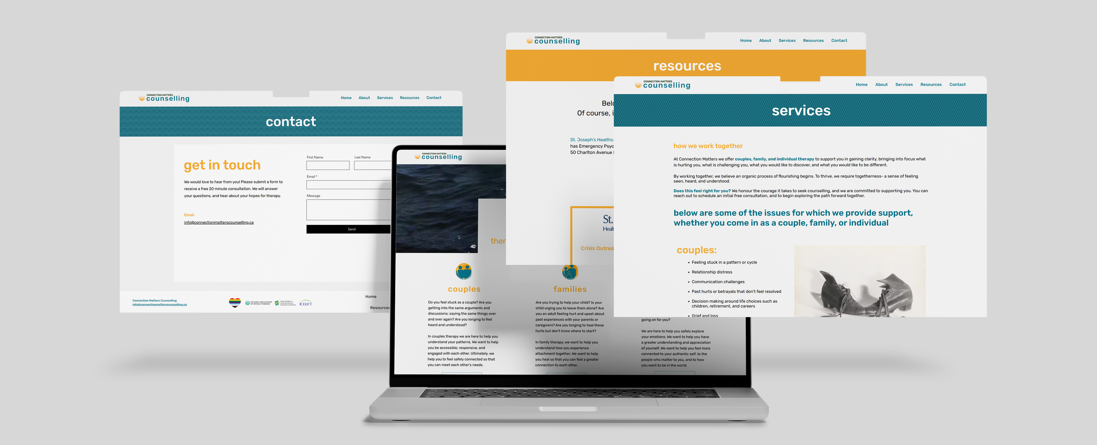
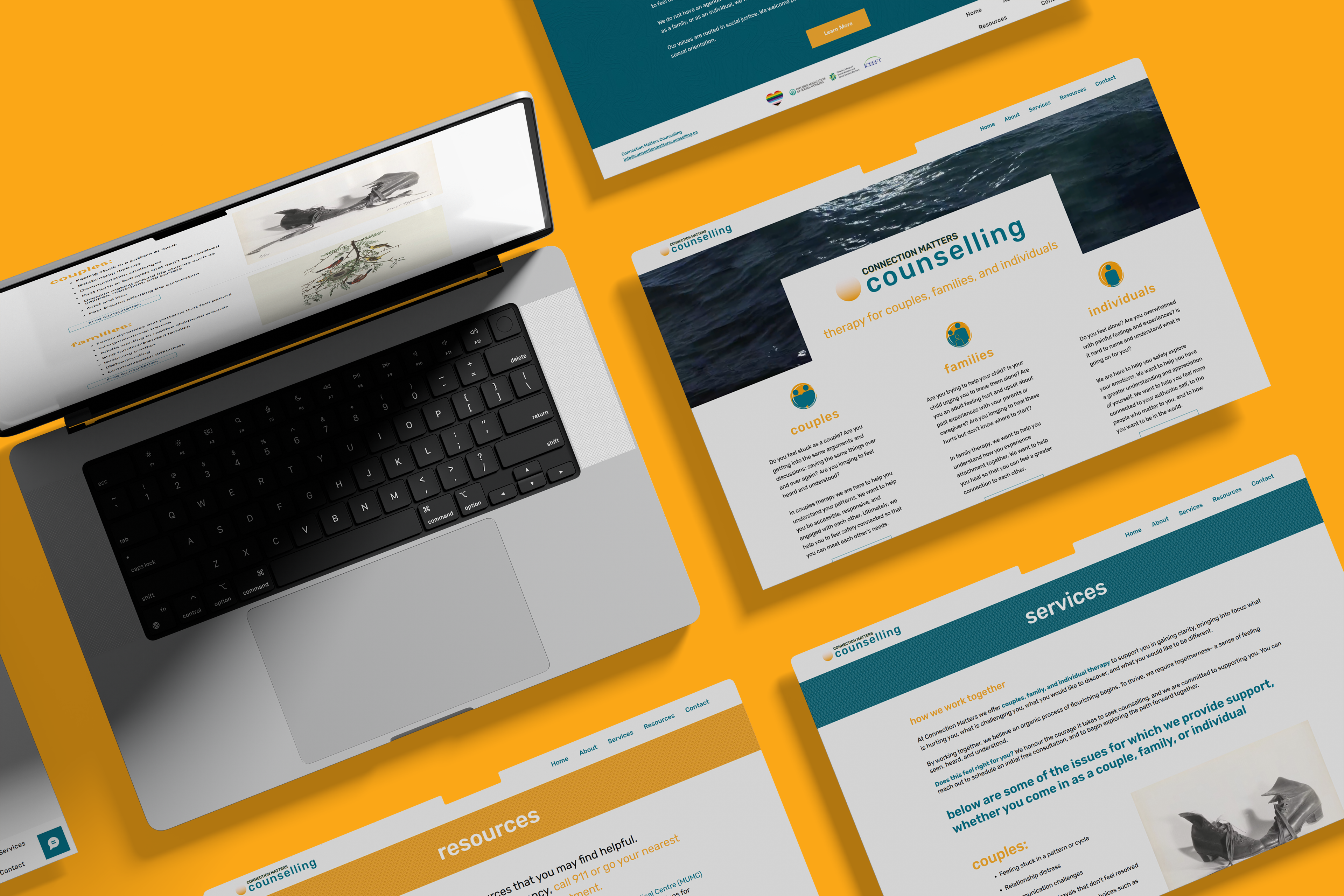
Digital Strategy: A Therapy Site, Reimagined
For the website, instead of traditional imagery, we used tasteful art and pops of color to guide the user’s eye.
Negative Space: Leveraging white space to ensure the "out-of-the-box" elements didn't feel cluttered, maintaining a sense of calm for the visitor.
Authentic Content: Swapping generic therapy visuals for custom-curated art that reflects the owner's professional-yet-spirited personality.
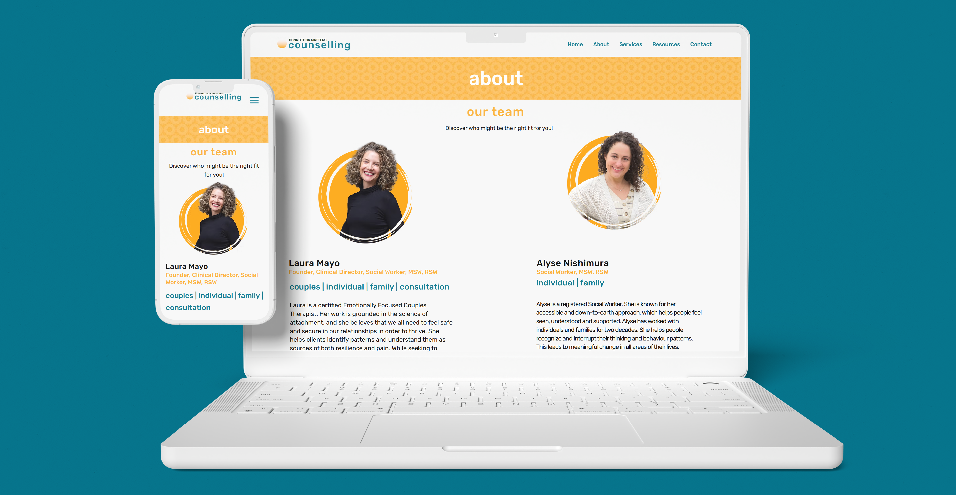
The Finished Identity
The final result is a brand that feels both established and fresh. It honors the "sober" requirements of a medical professional while clearly communicating that this is a space for modern, dynamic, and creative growth.