I had the pleasure of collaborating with Staples as the Art Director and Graphic Designer for a project centered around their Print and Marketing services. My mission was to meticulously create unique brand identities for 10 diverse verticals, which ultimately were strategically positioned to showcase and promote Staples' print services.
The goal of this project was to produce visuals that not only captured attention but resonated with a sense of familiarity, akin to stumbling upon a well-established entity in the real world. Because of this, I dedicated significant time to thorough research on real-world companies. This comprehensive research not only informed the conceptual foundation of my designs but also ensured that each element was rooted in reality.
Spice Street Restaurant & Catering:
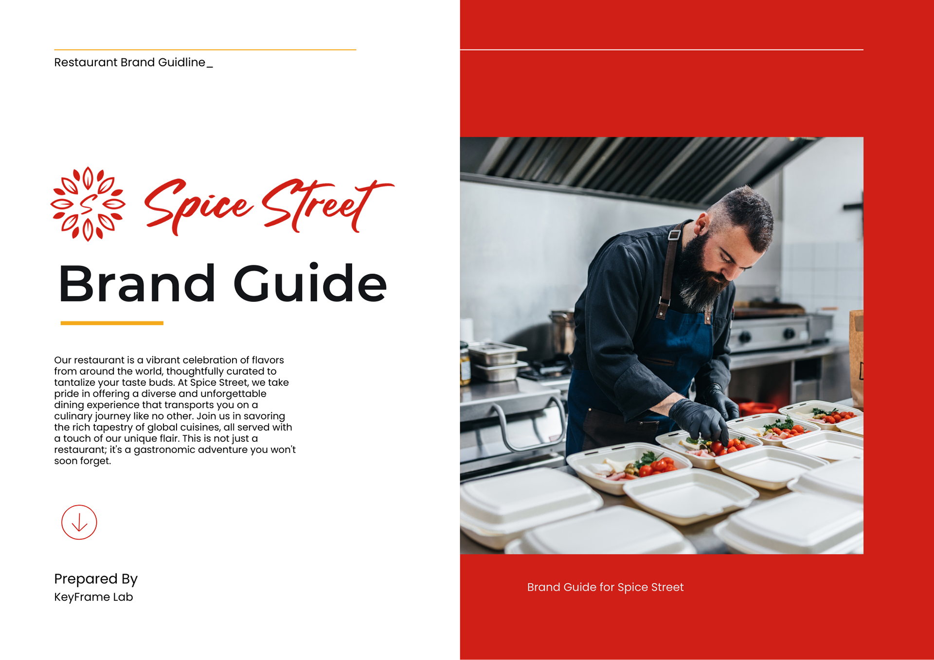
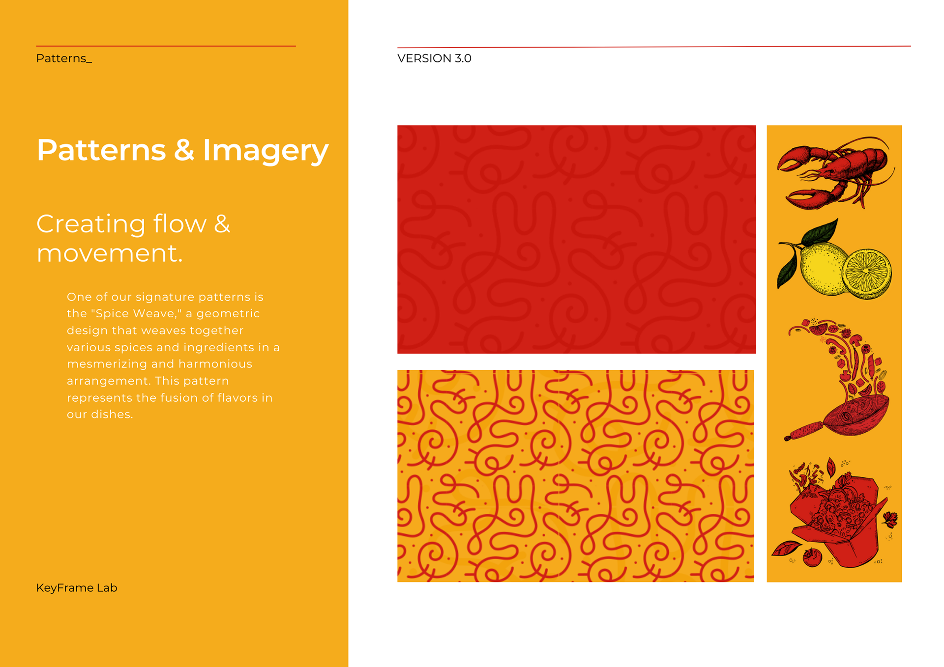
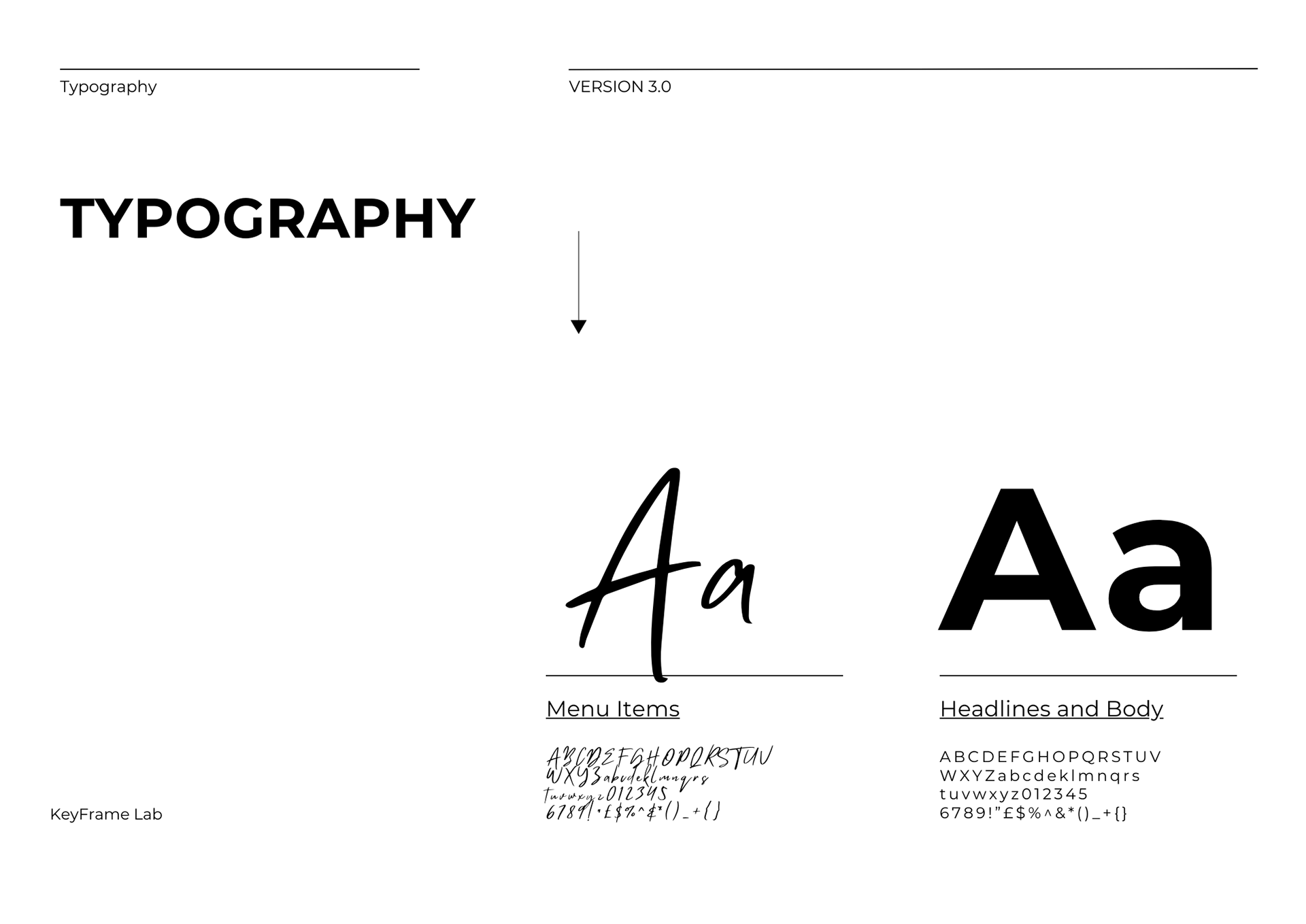
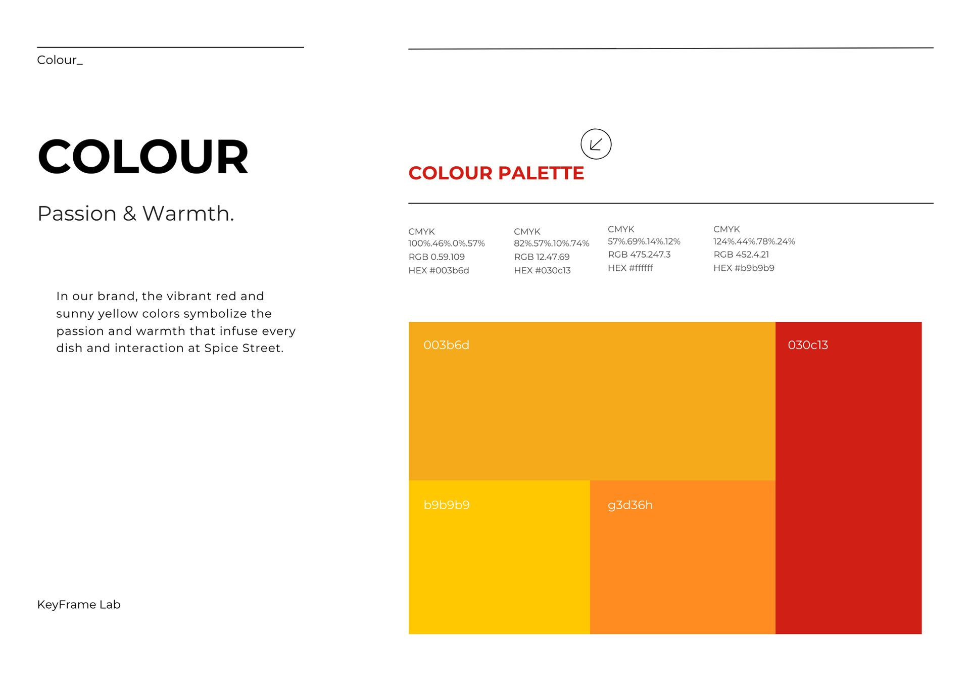
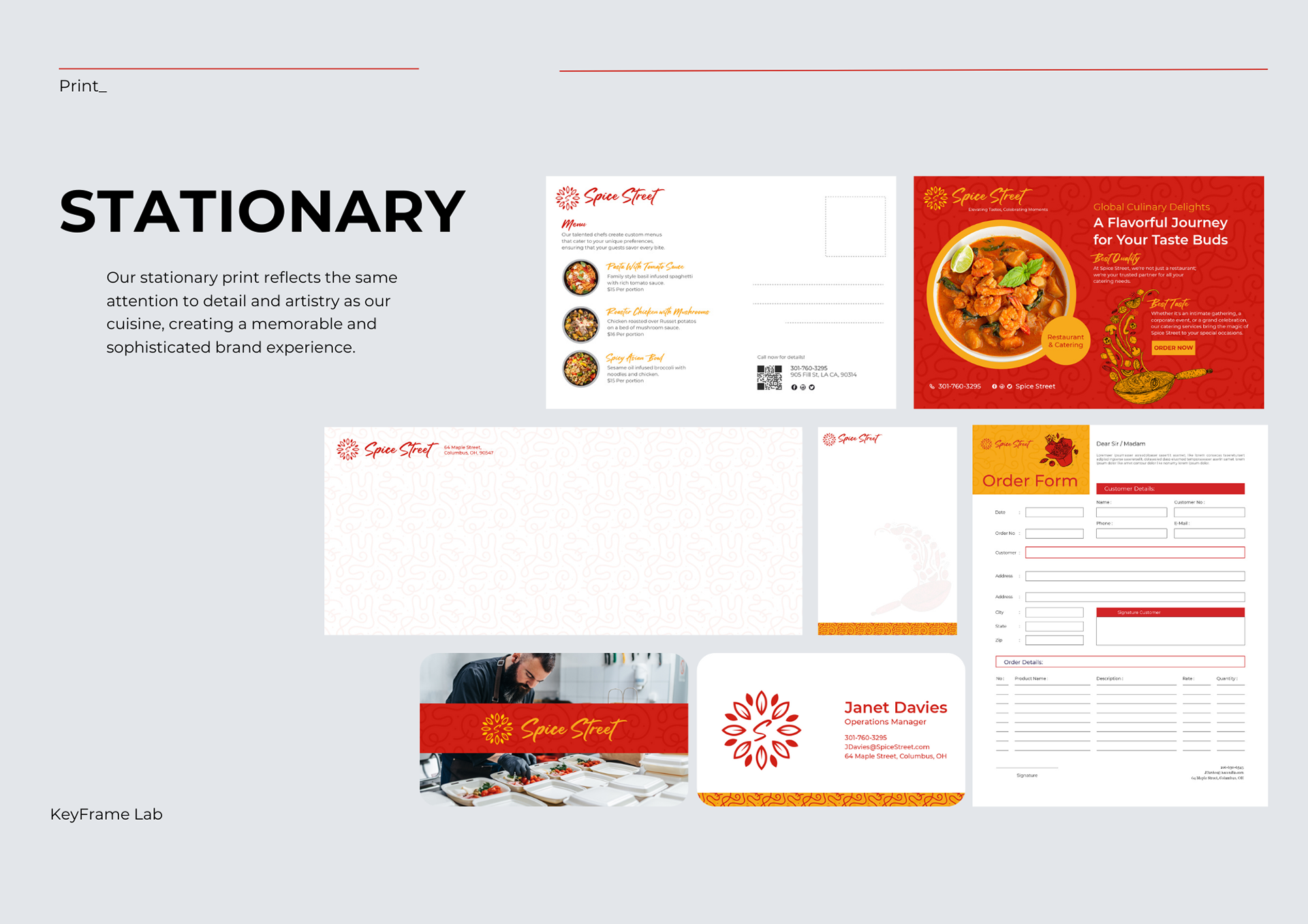
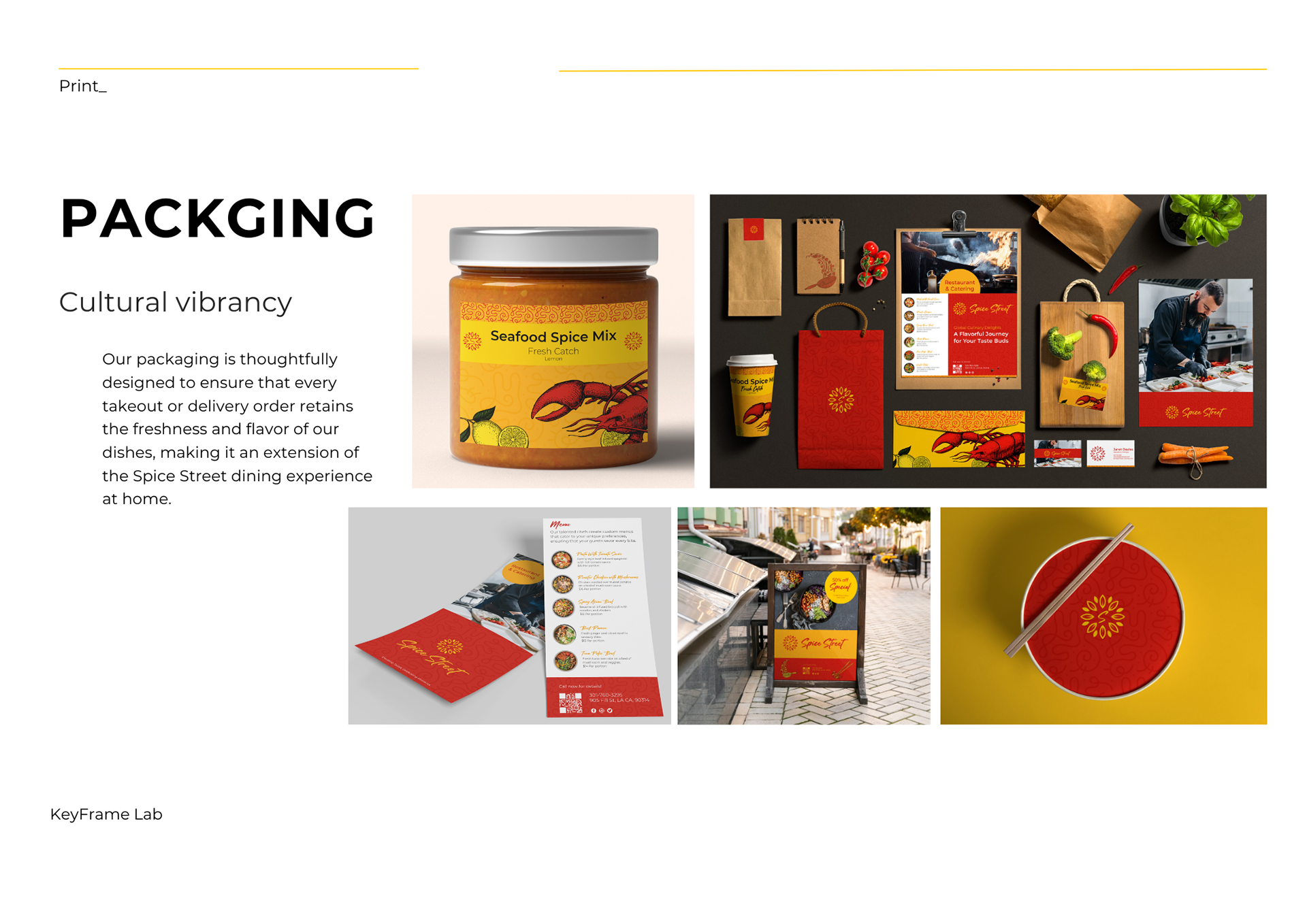
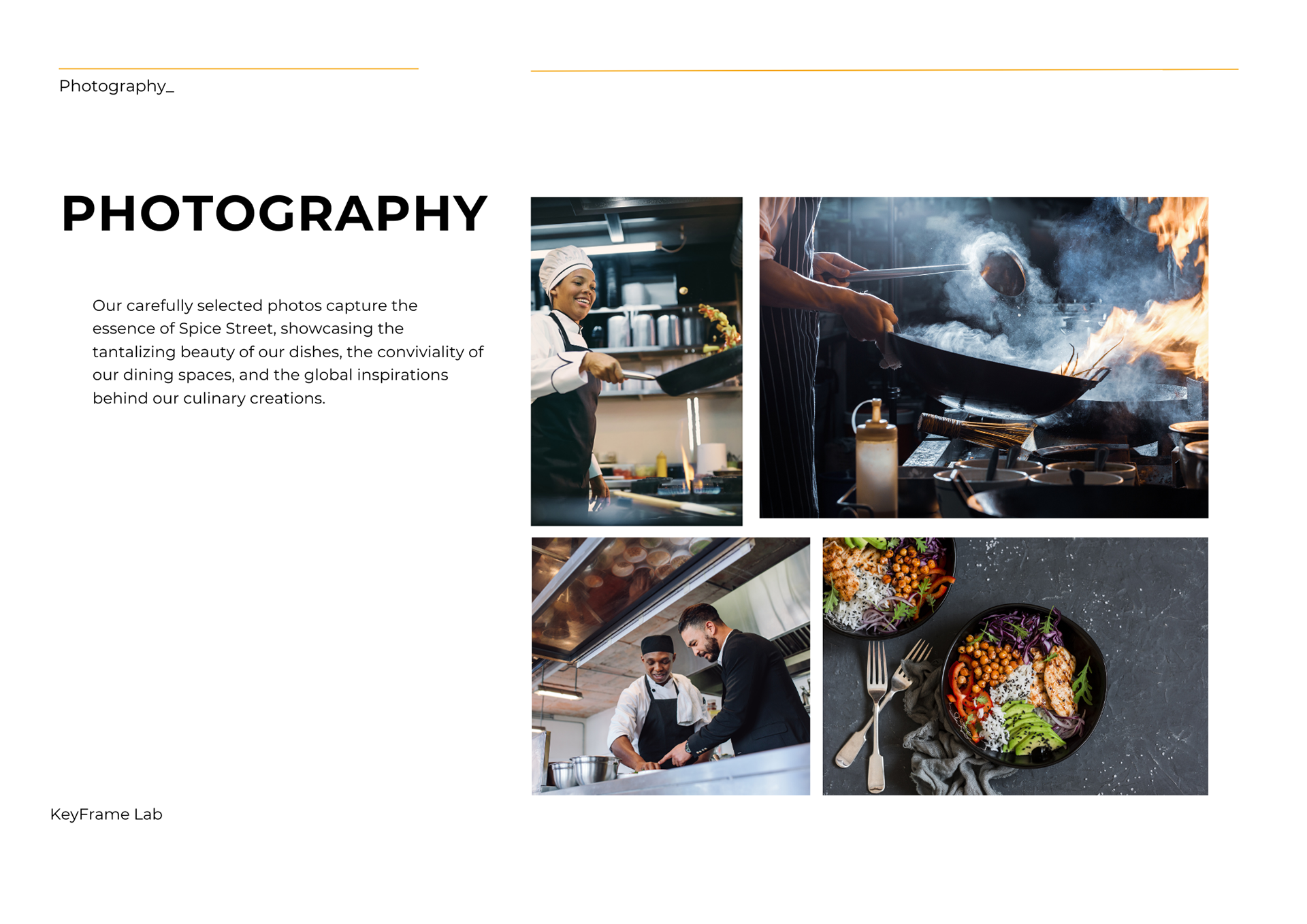
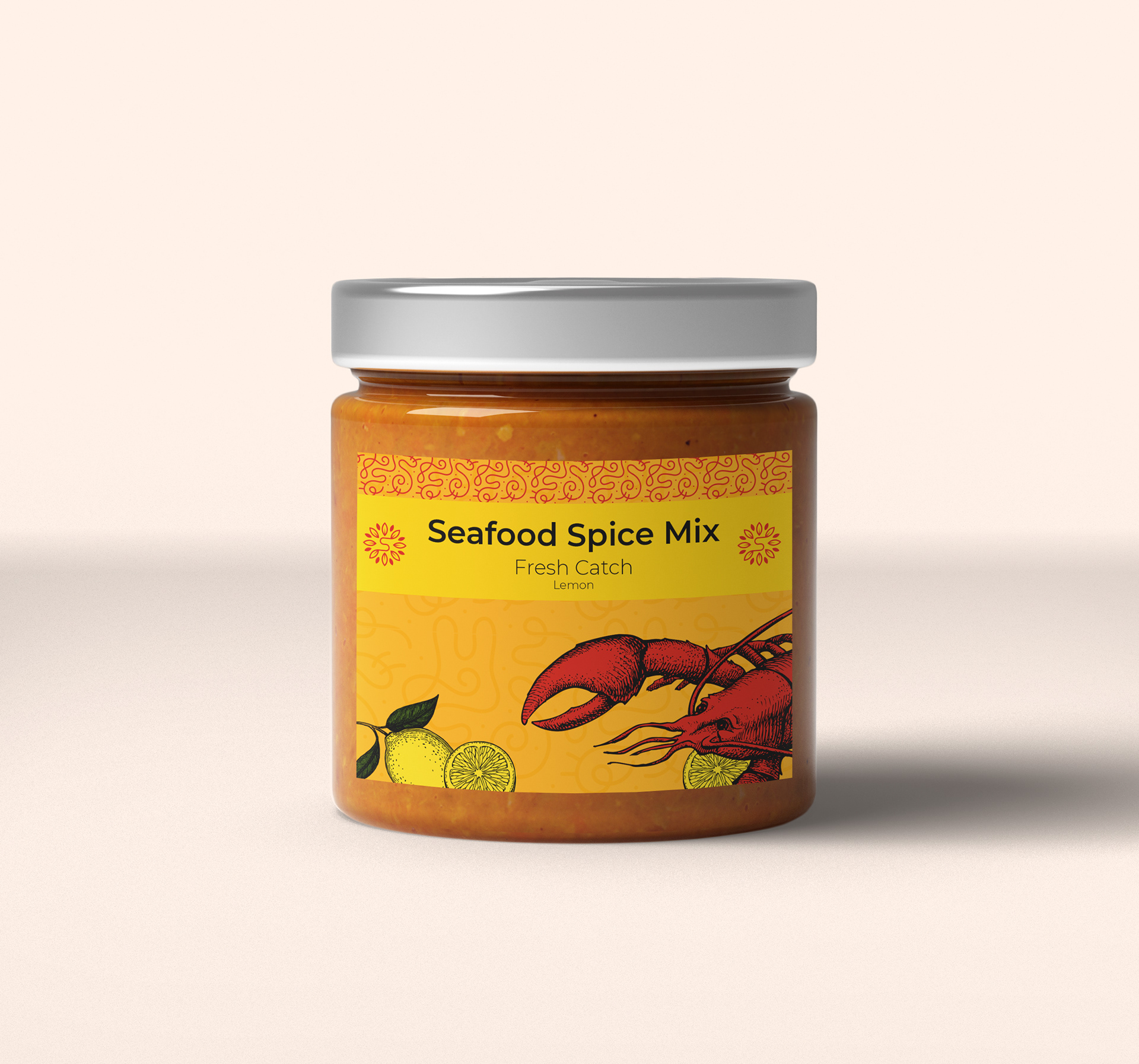
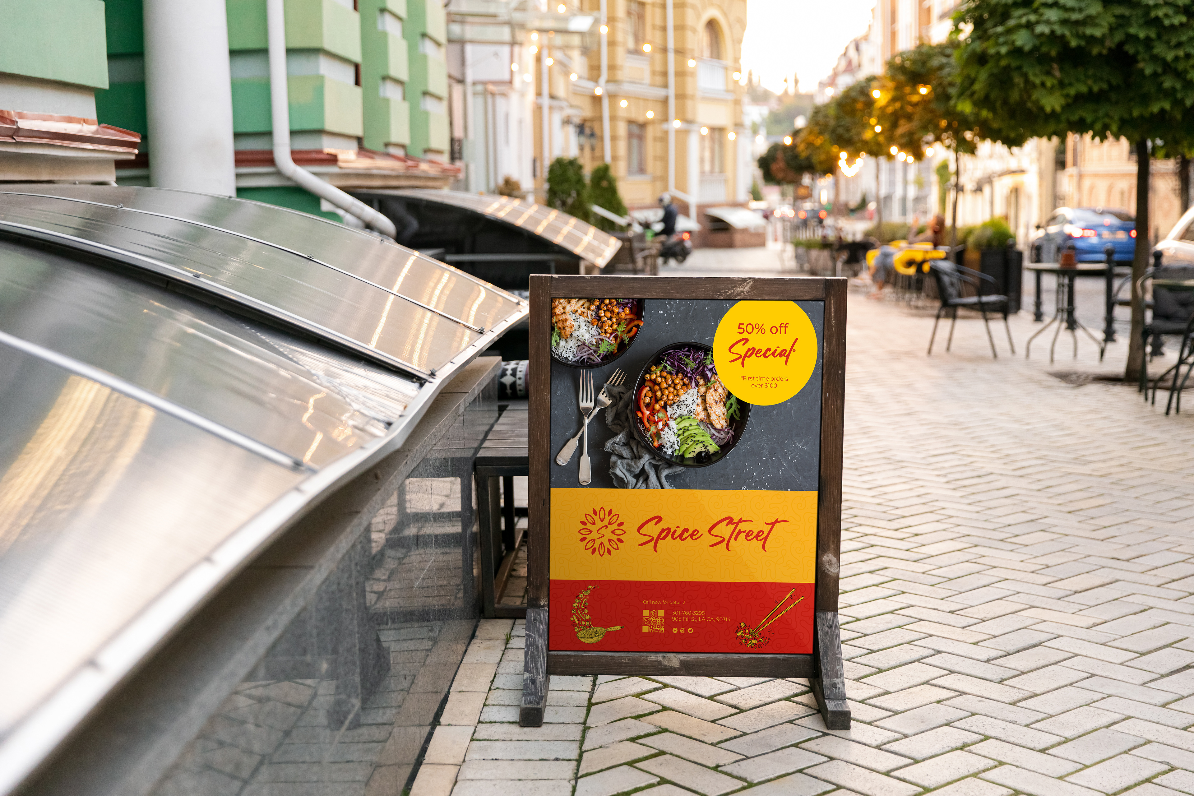

With Spice Street Restaurant & Catering, I sought to encapsulate the company's zest for life and bold culinary offerings. The energetic color palette, featuring vivid reds and sunlit yellows, spills across a range of materials, including enticing brochures that tell the story of Spice Street's culinary prowess, eye-catching posters that beckon food enthusiasts, packaging labels that ensure a feast for the eyes before the palate, and sleek stationary that carries the brand's personality with every written word.
Athletic Soles Retail:
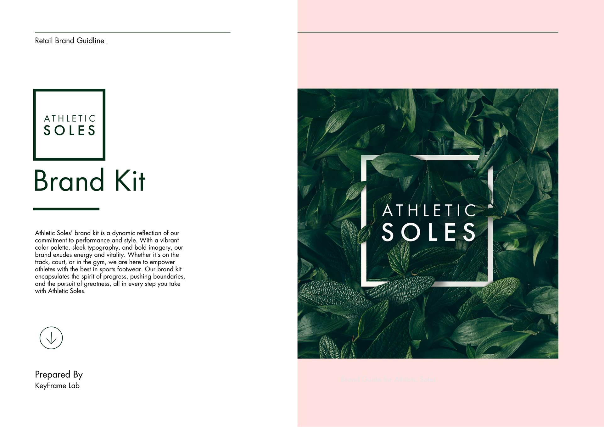
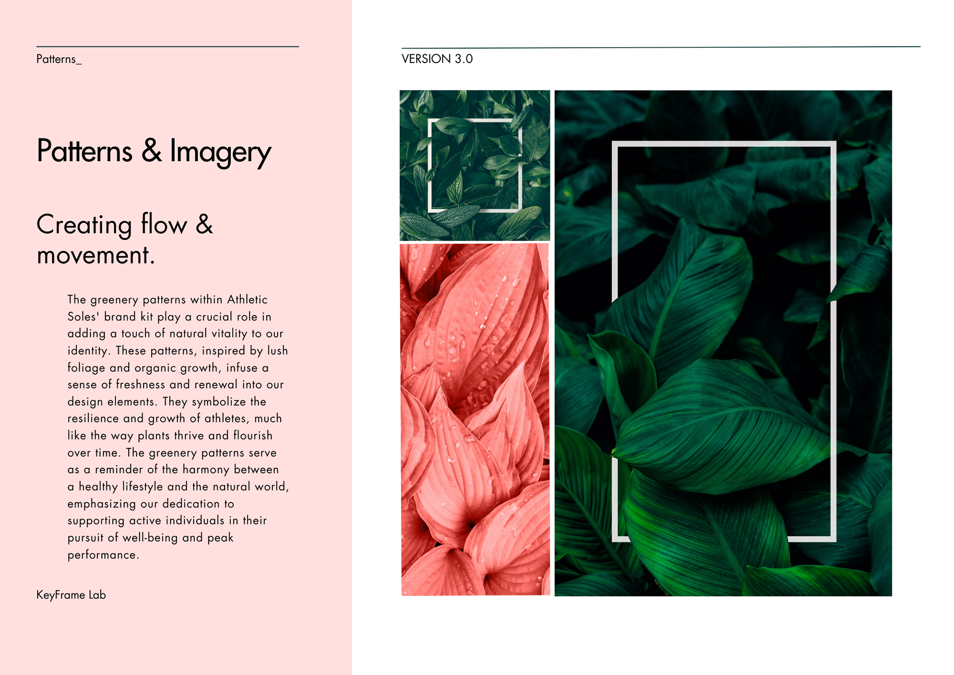
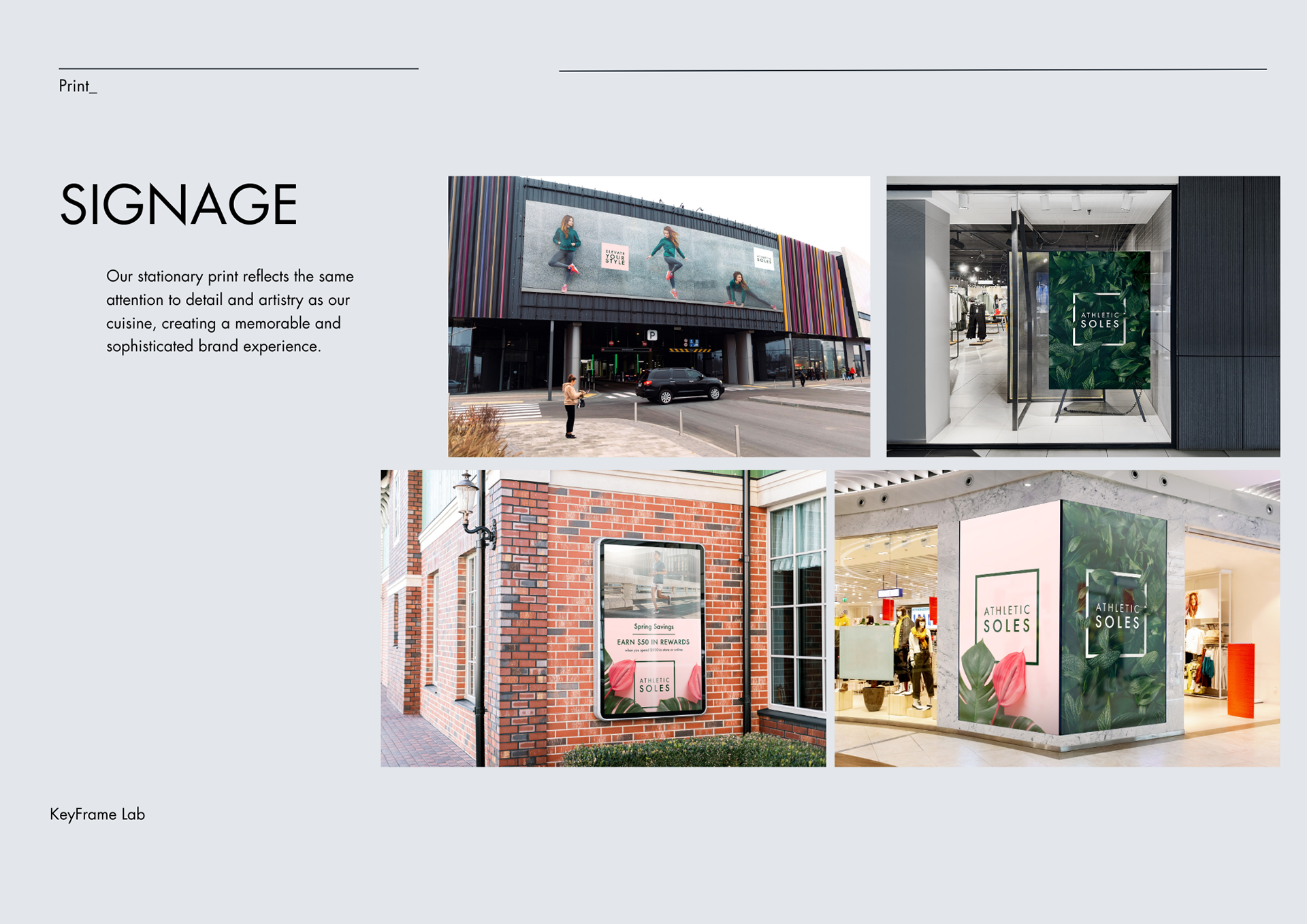
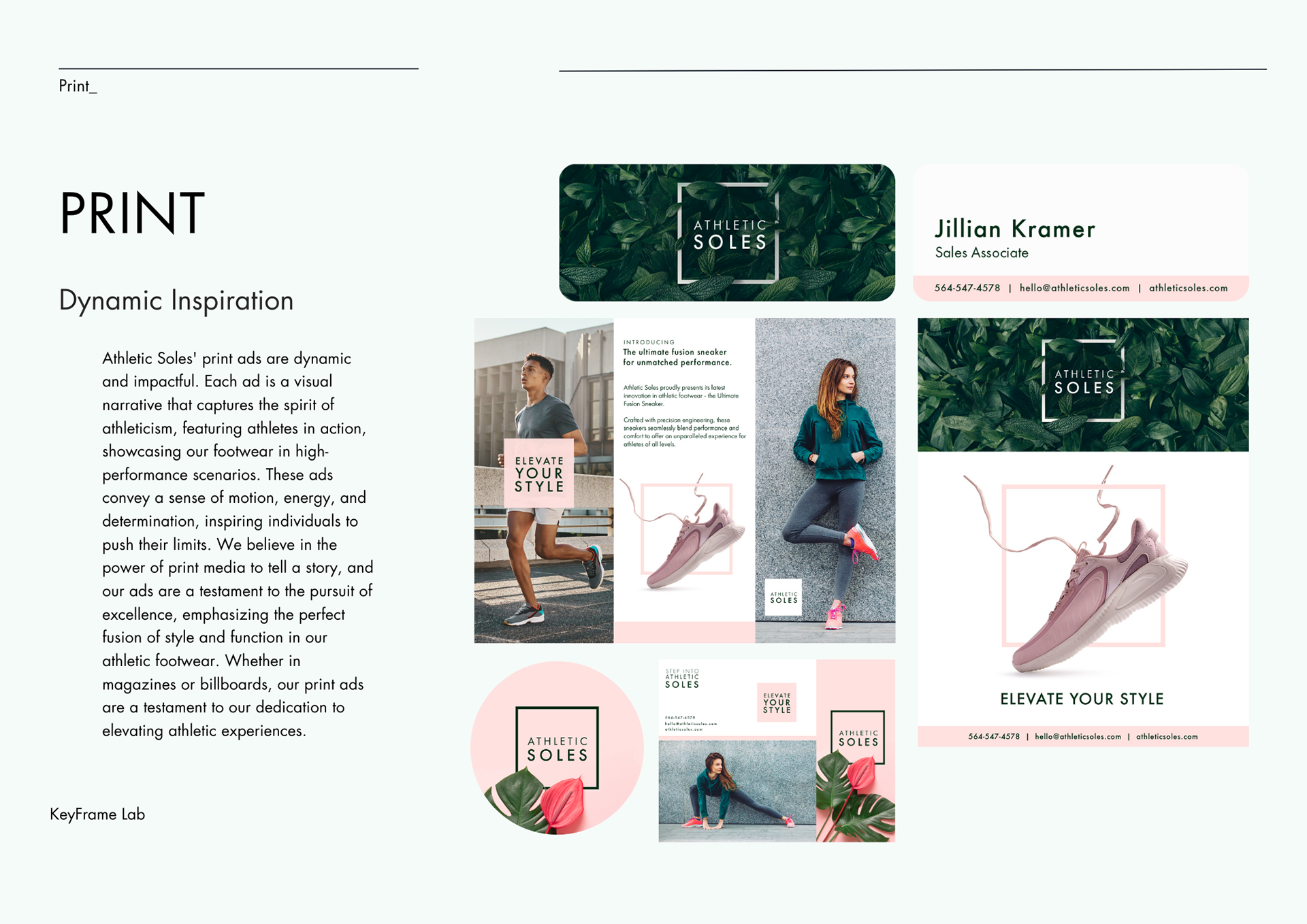
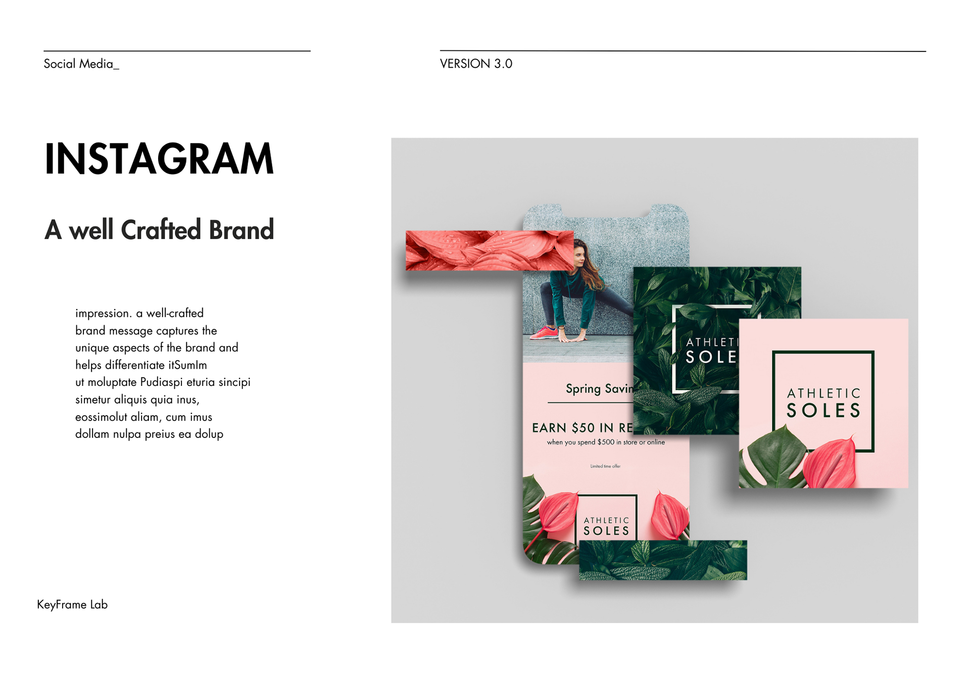
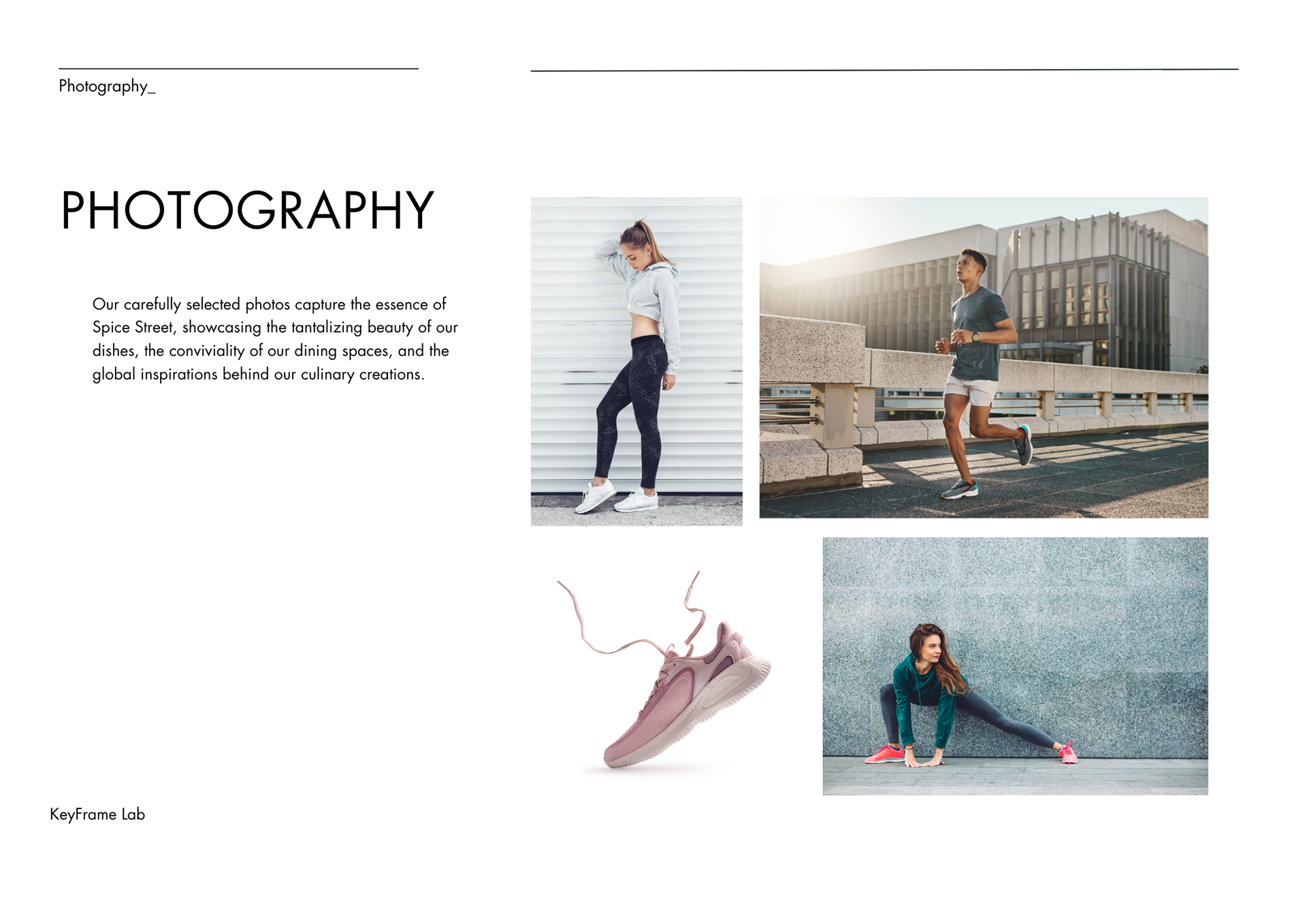
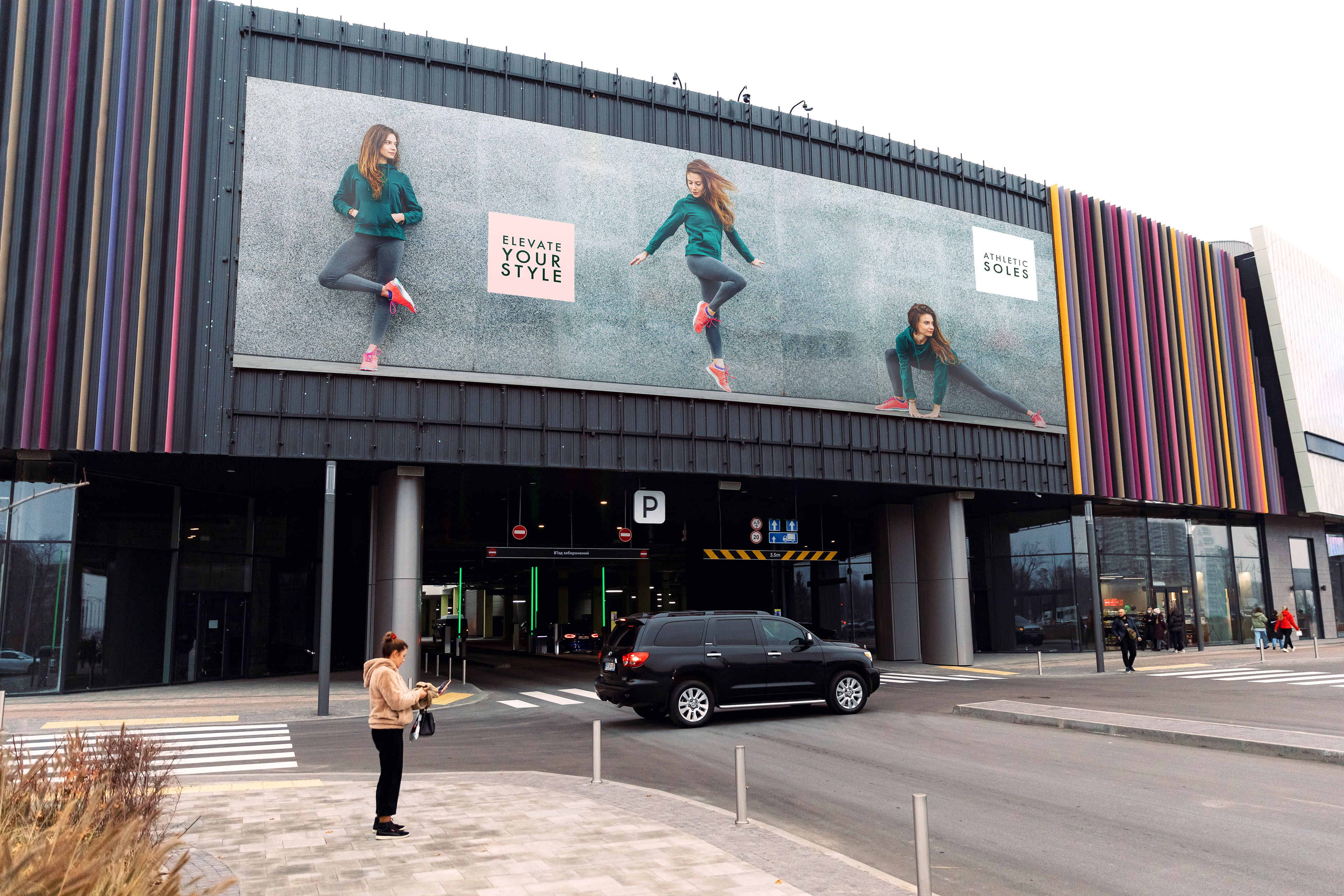
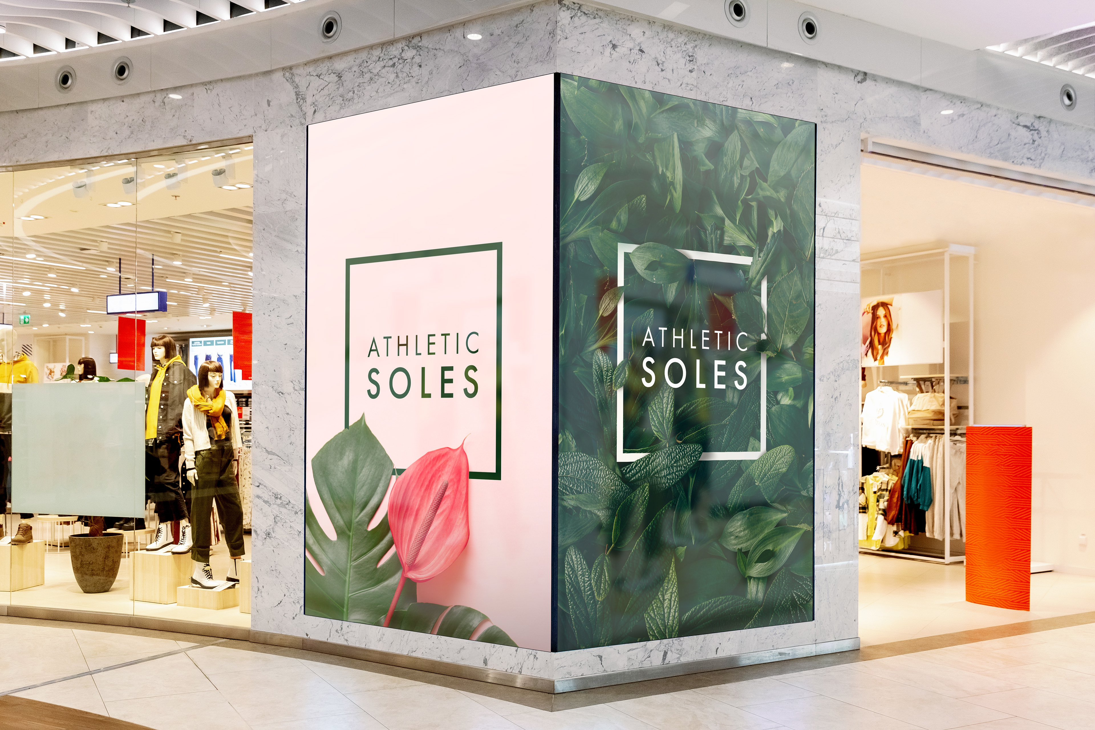
Inspired by the vitality of nature, Athletic Soles aesthetic is adorned with lush foliage, infusing every aspect of the athletic clothing retail company with a sense of rejuvenation. The color palette of invigorating greens and complimentary coral mirrors the dynamic spirit of the activewear. From brochures to in-store banners that echo the store's commitment to both fashion and function, postcards that carry the promise of an active lifestyle, to stationary that embodies the brand ethos, Athletic Soles brand fuses nature and athleticism.
Elite Auto Dealership:
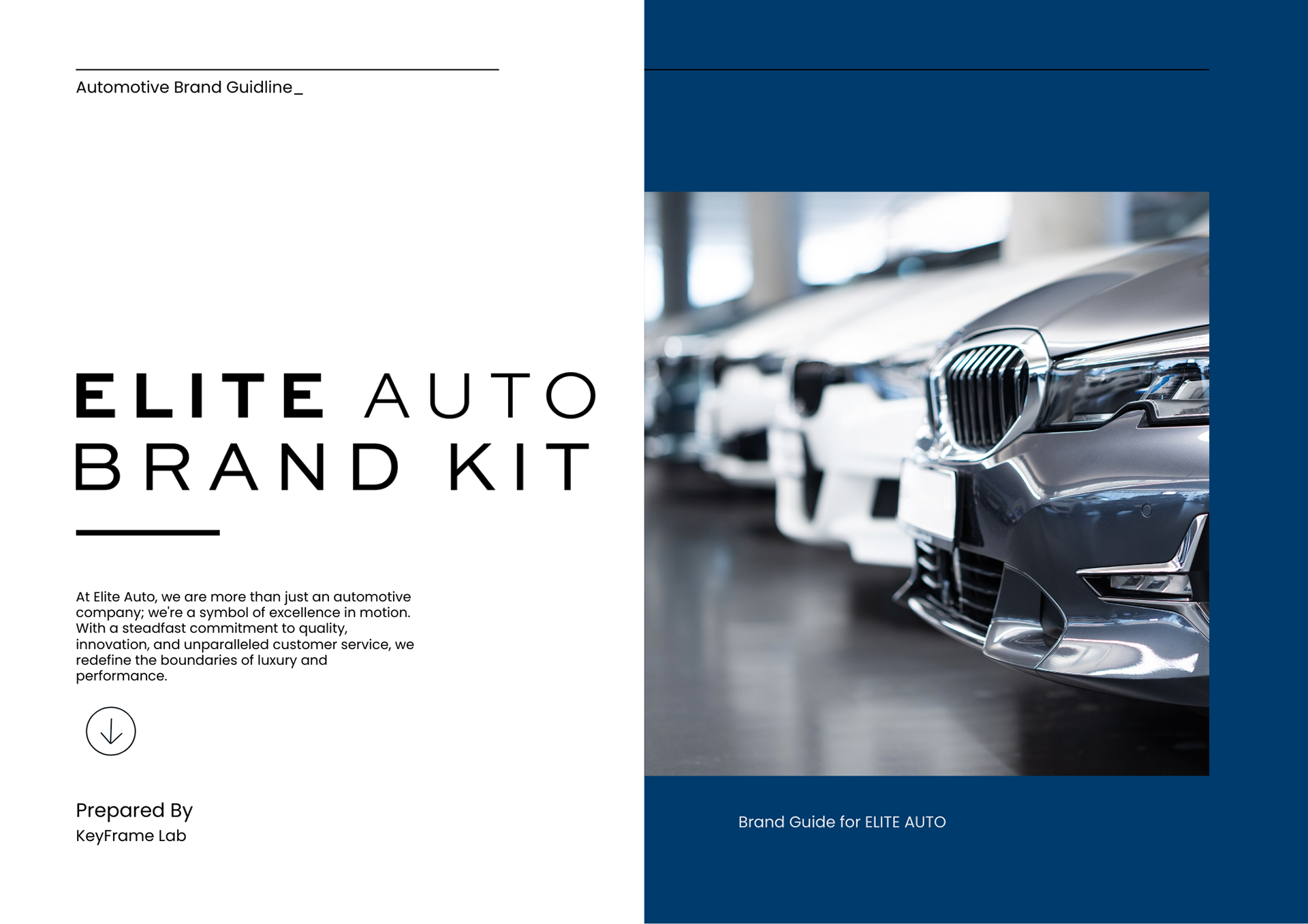
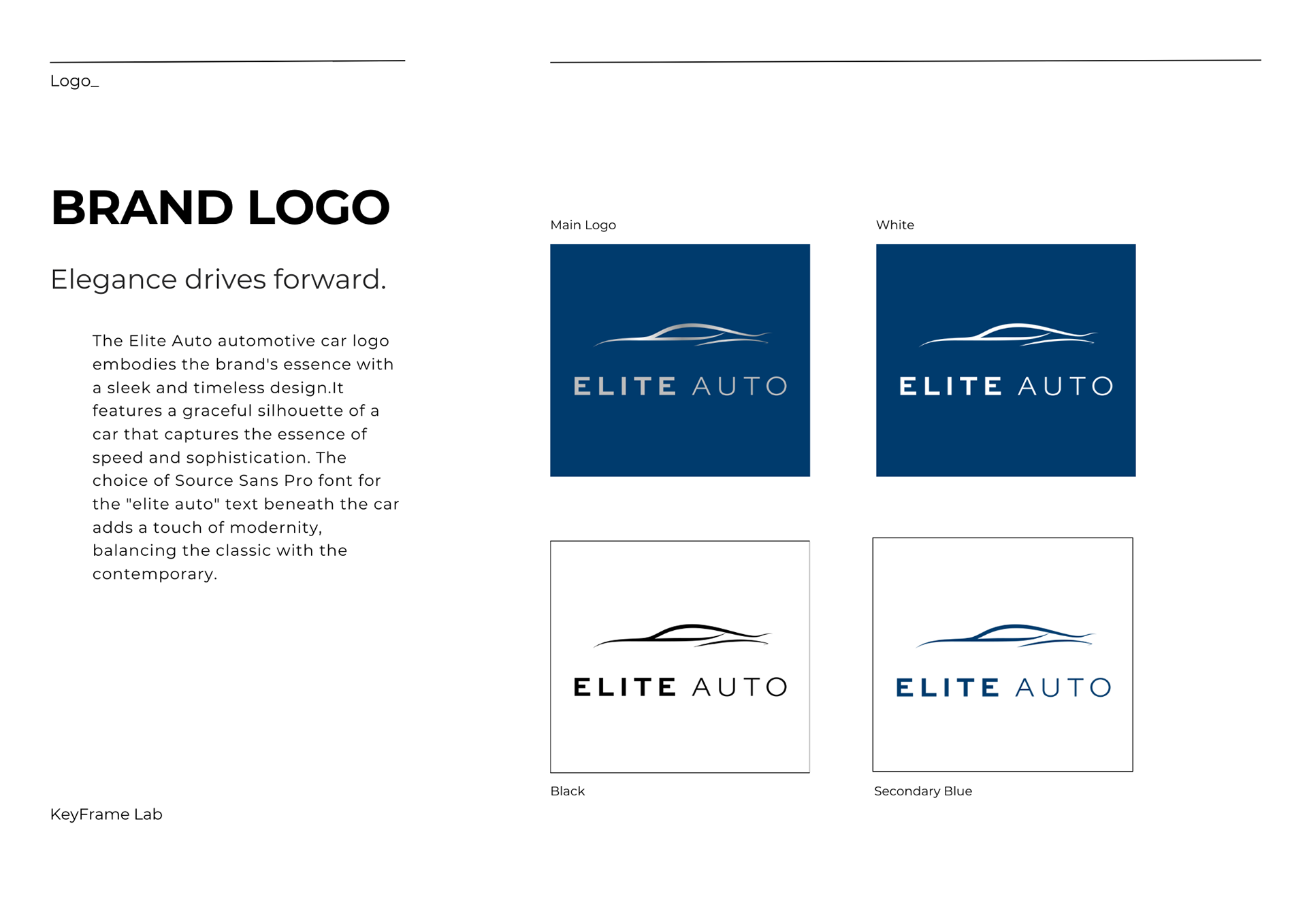
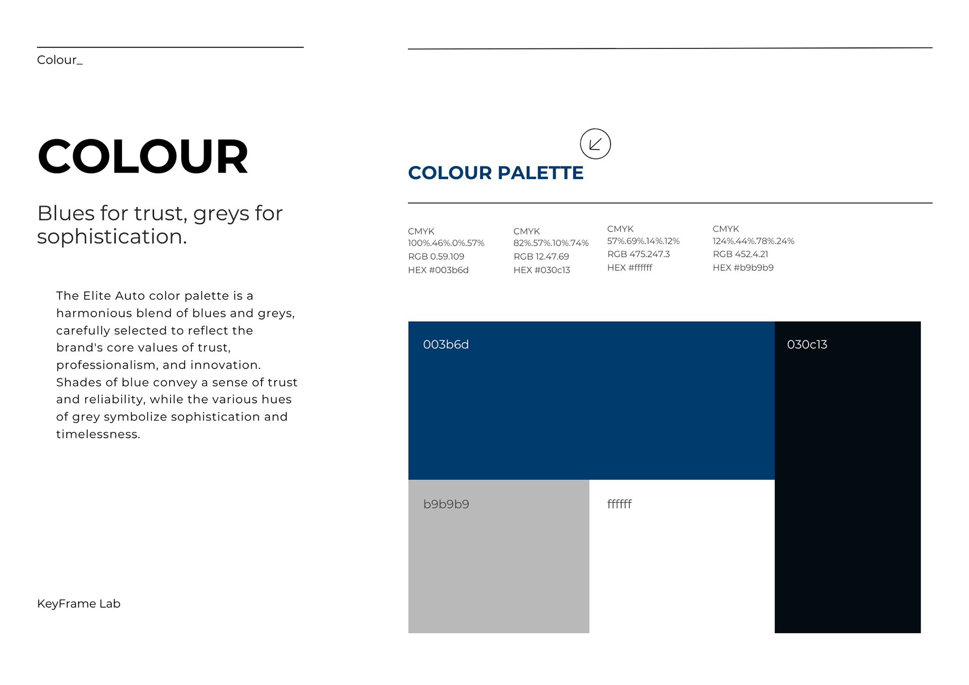
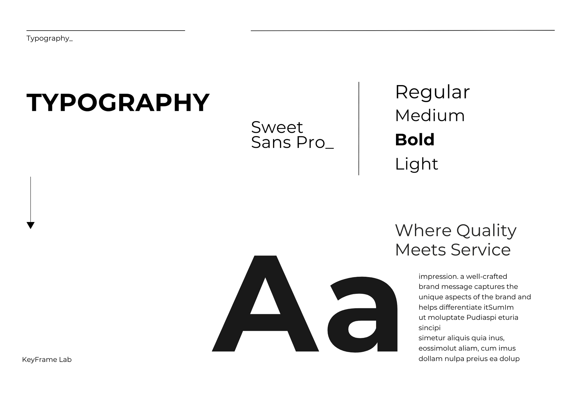
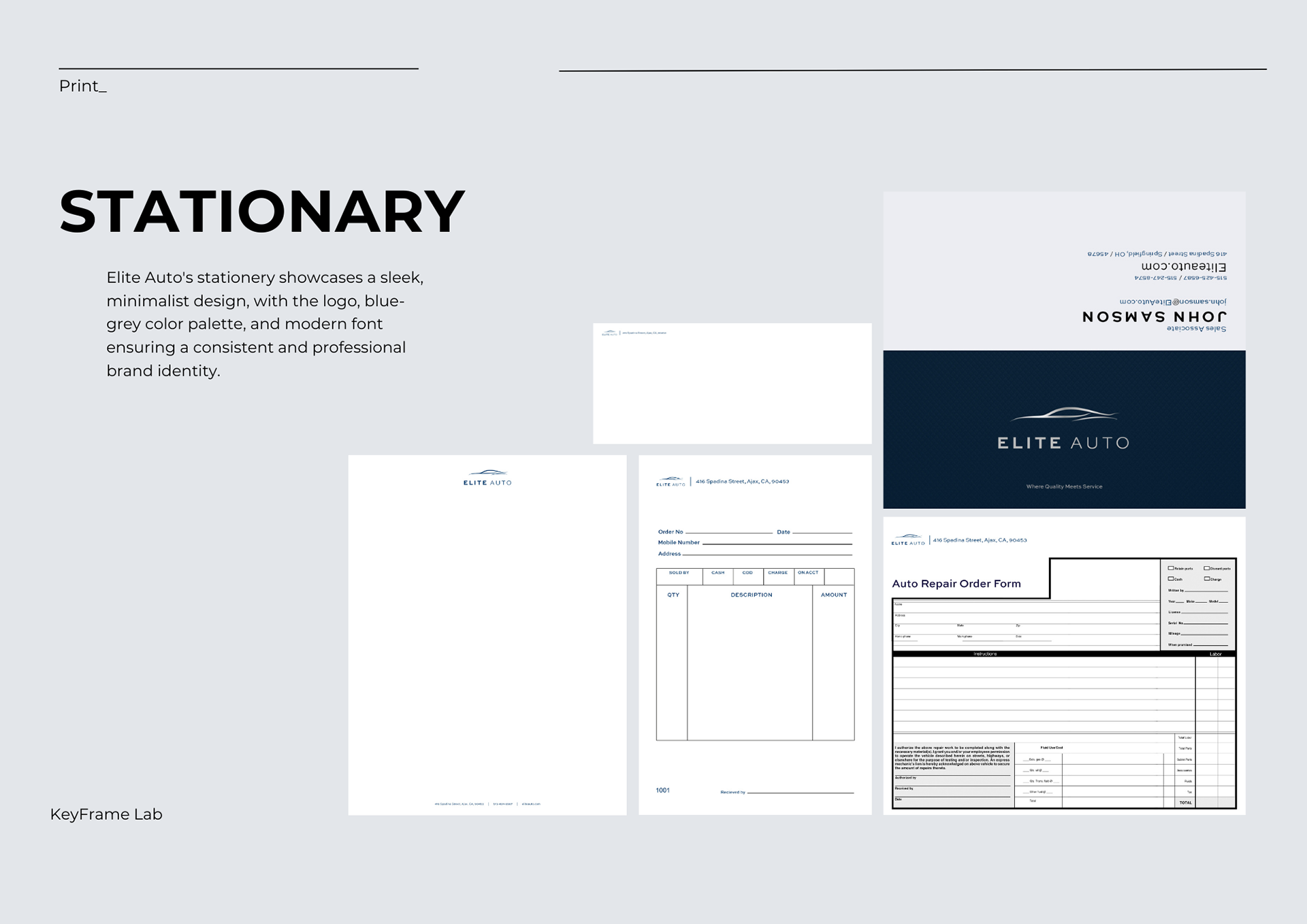
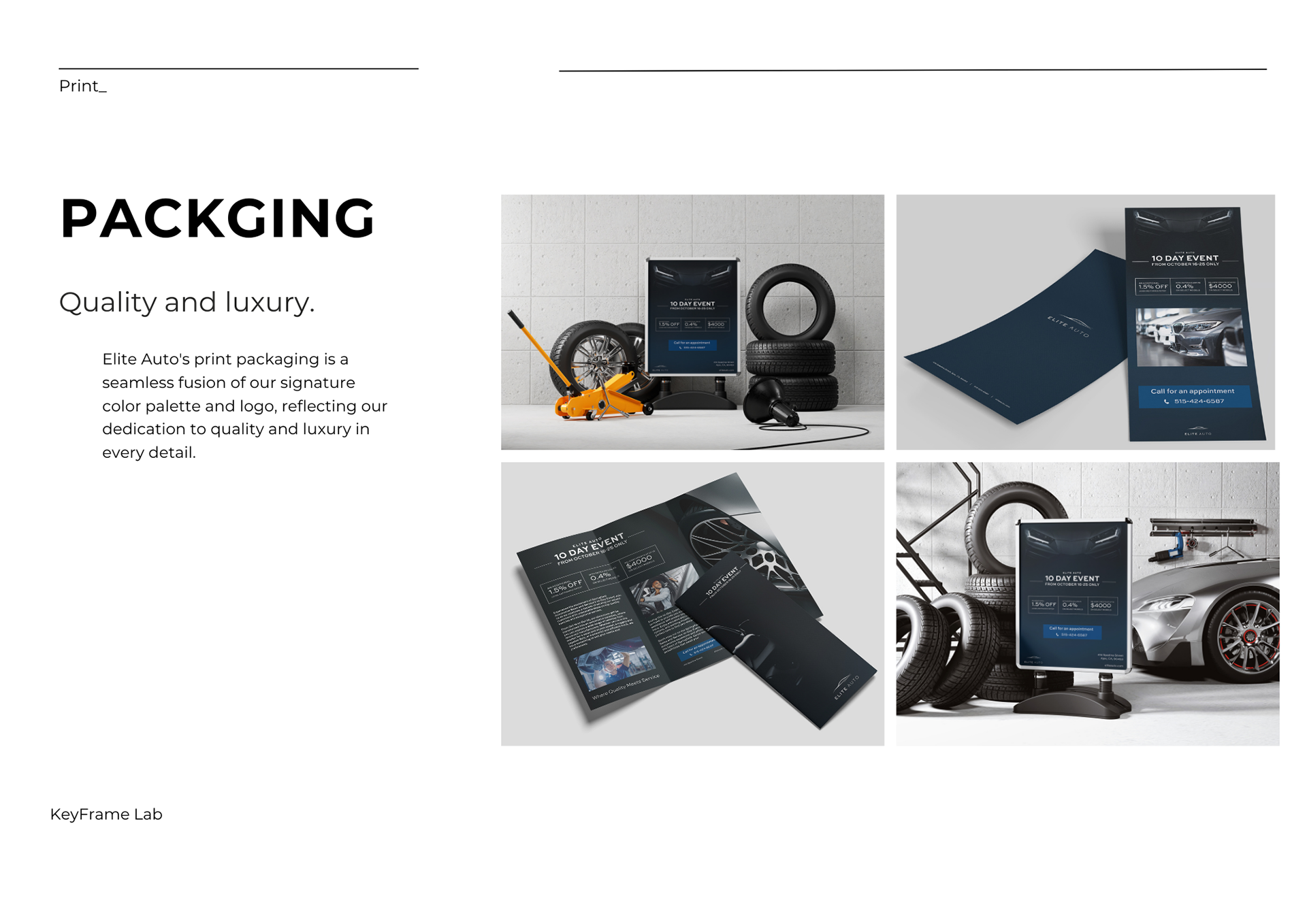
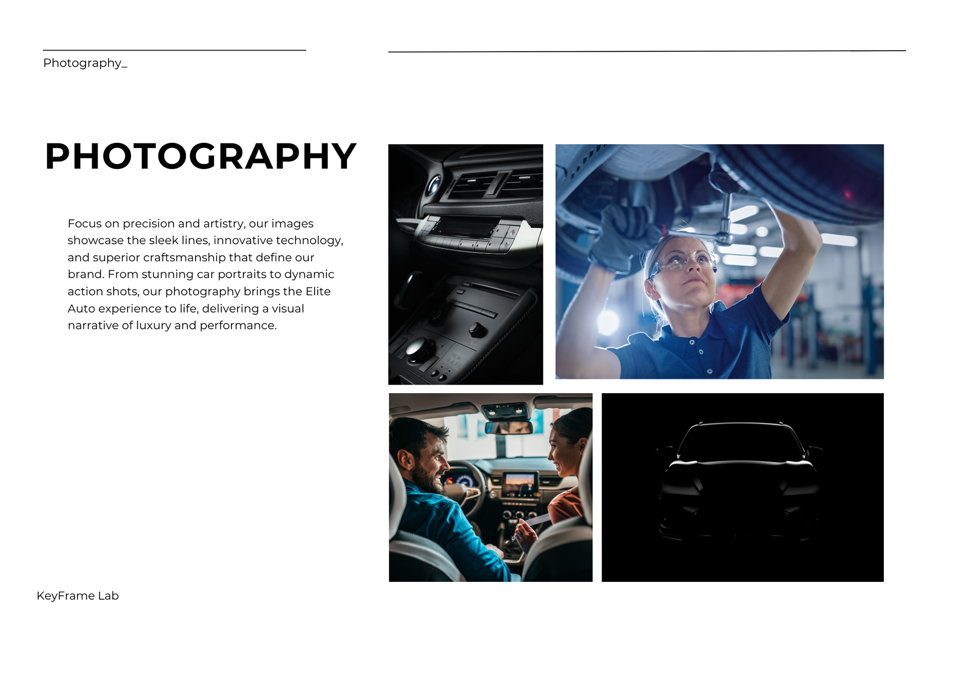
This was the visual identity for Elite Auto, a made-up high-end car dealership. With a color palette featuring dark blues, greys, and blacks, my intention was to echo the sophistication inherent in Elite Auto's theoretical lineup. I ensured that each piece, from brochures to in-store banners, postcards, and stationary, reflected the dealership's aura of exclusivity. Sleek photography served as a key tool in capturing the essence of the luxury vehicles.
ACU University:
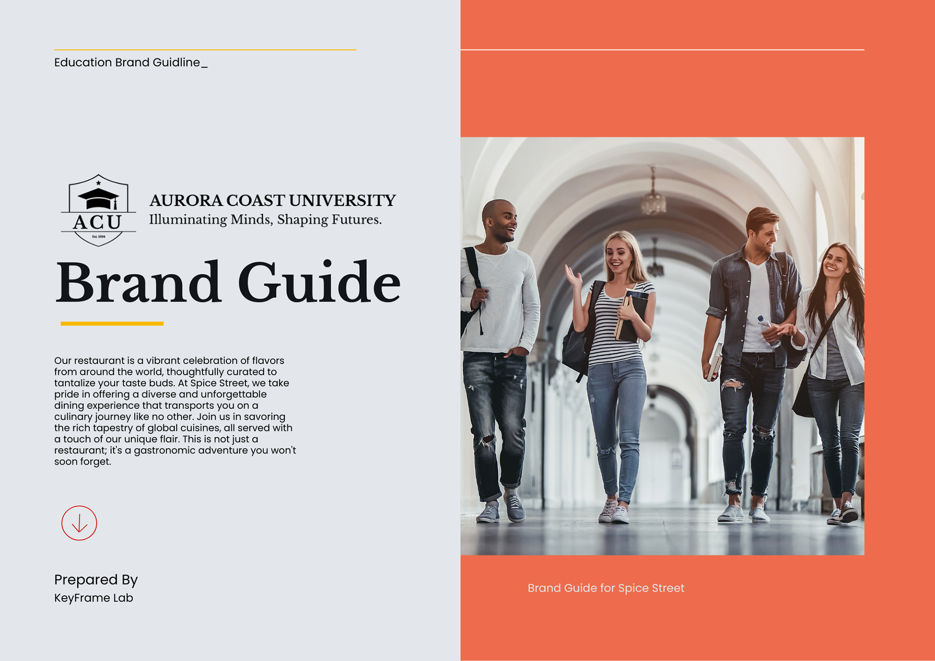
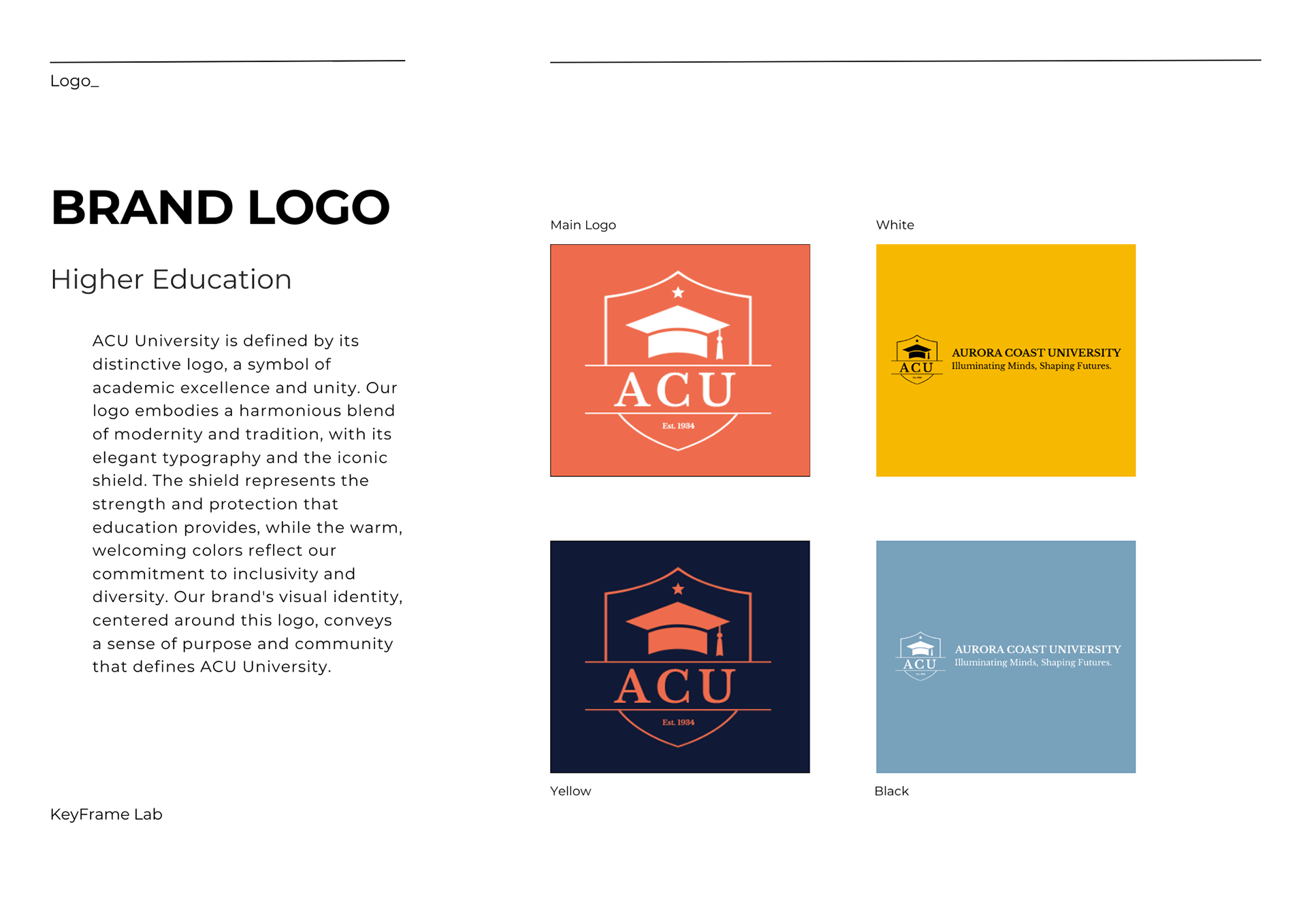
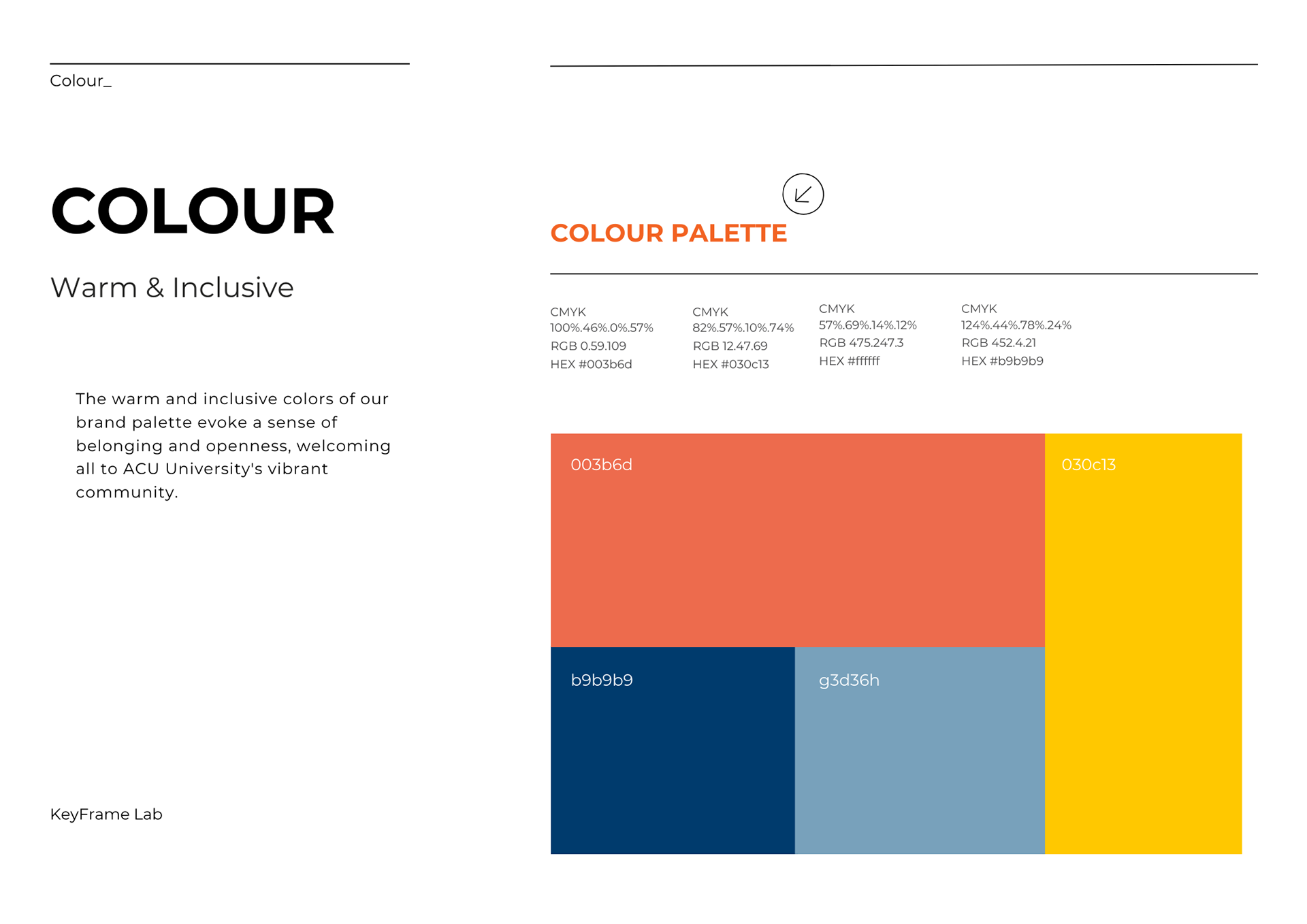
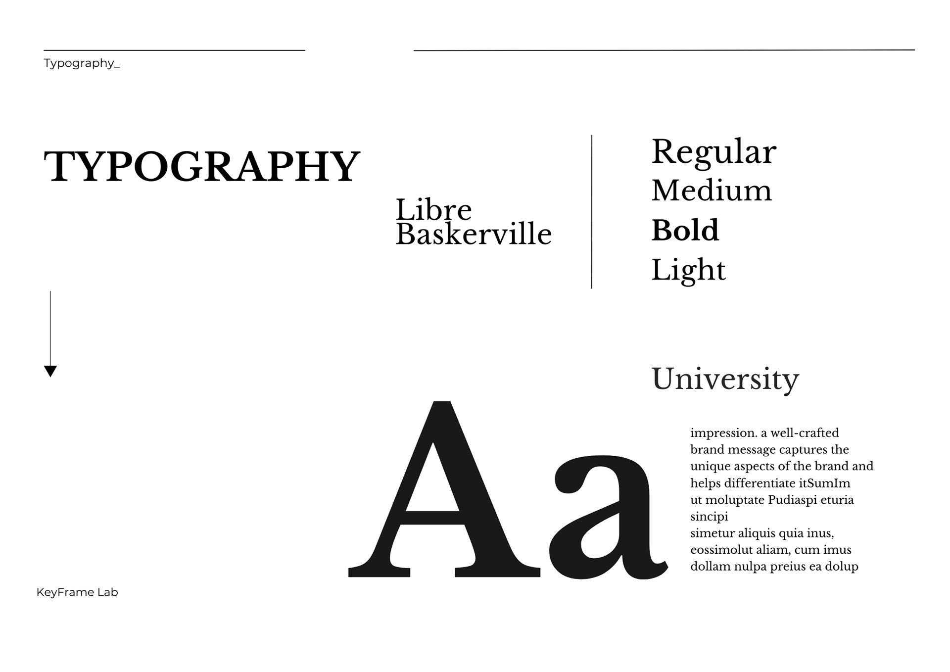
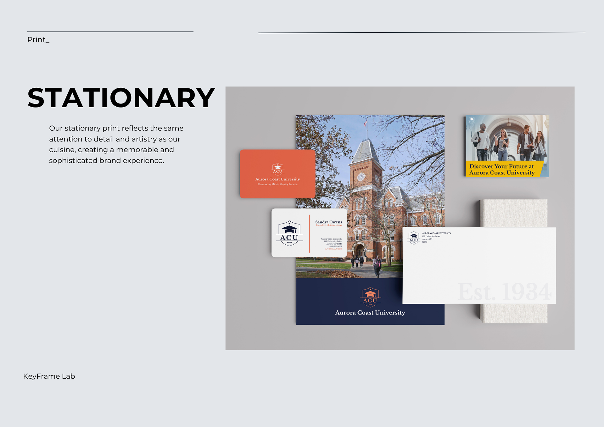
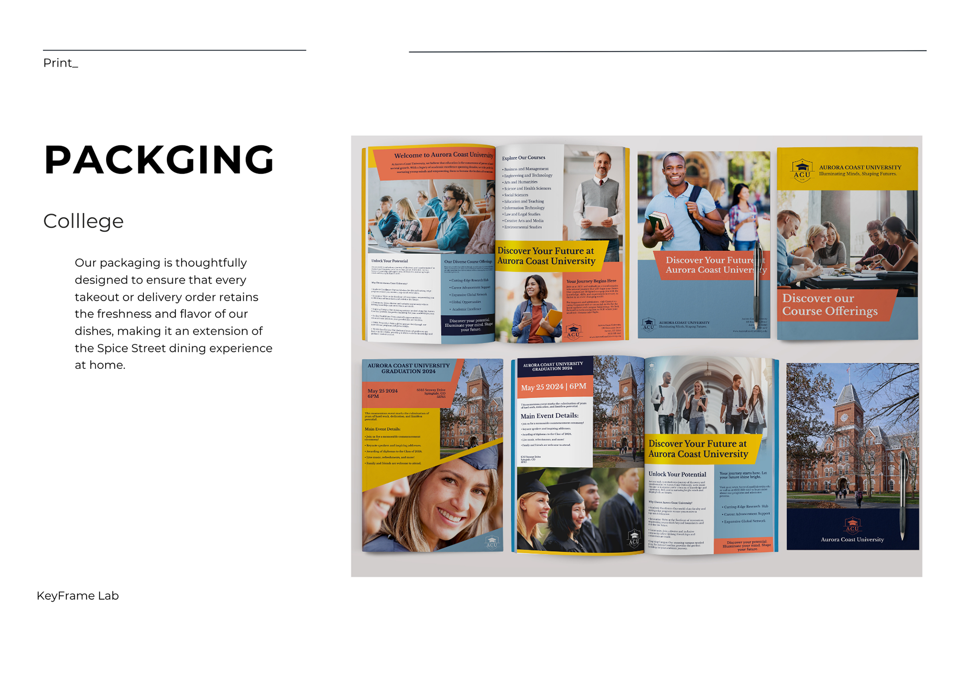
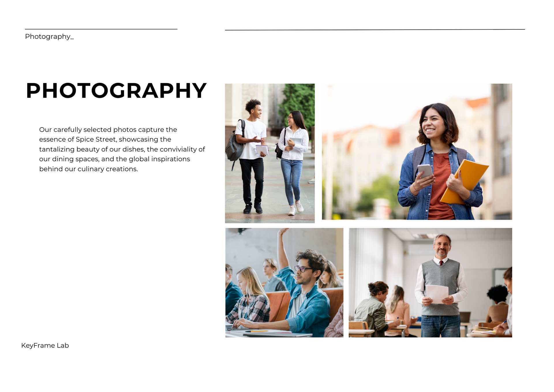


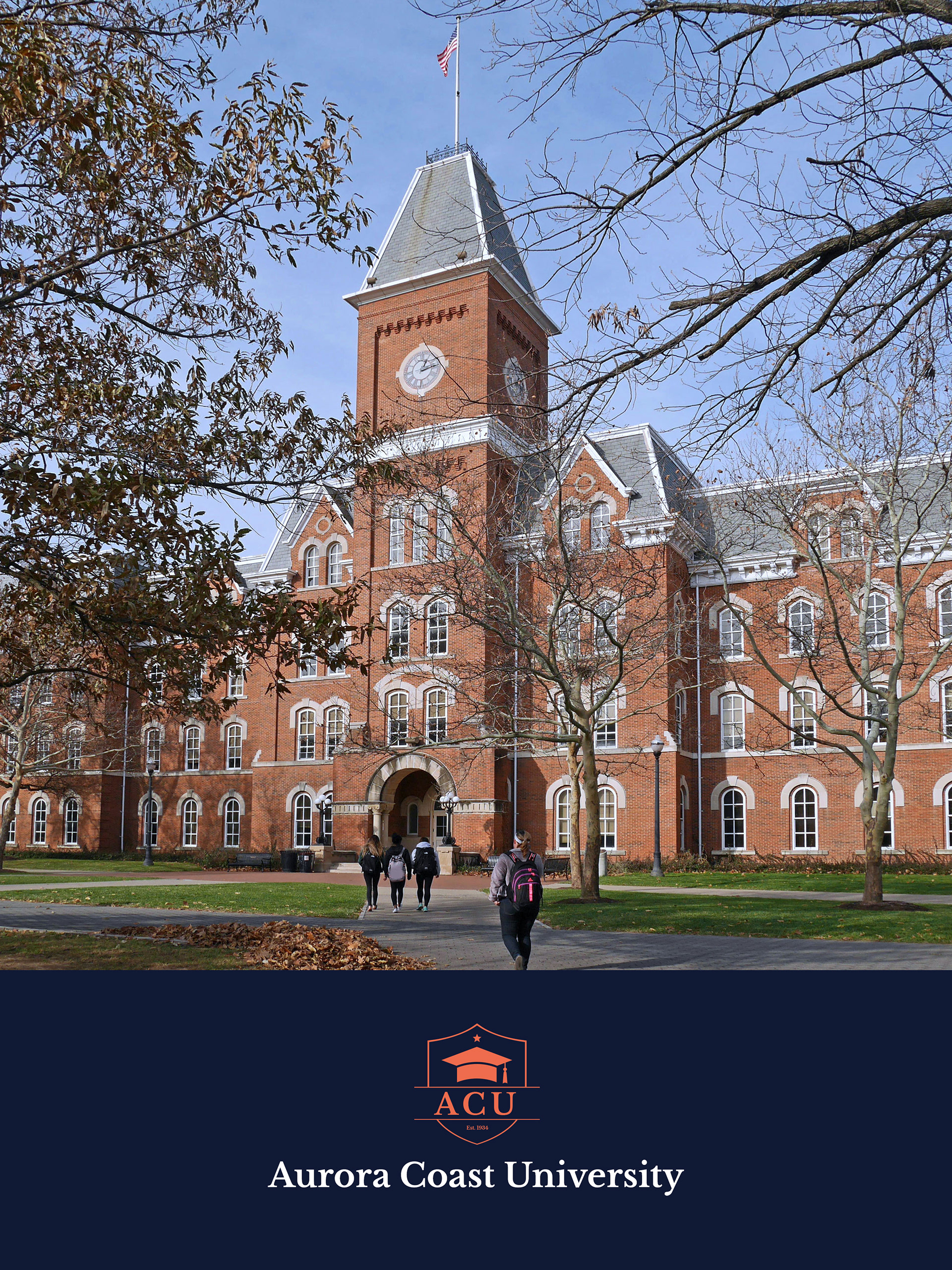
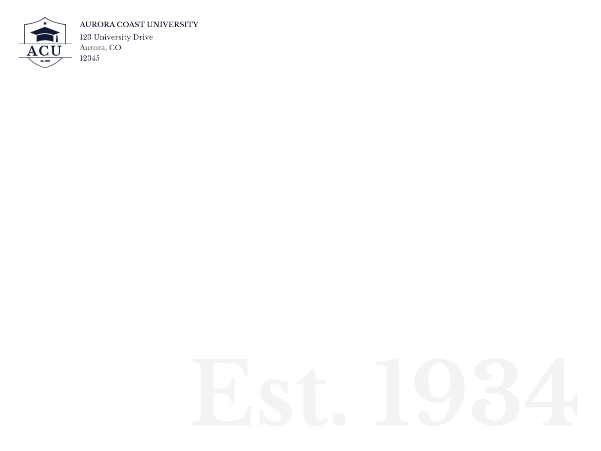
Immersed in the vibrant spectrum of corals, dark blues, yellows, and whites, the brand design for ACU, a fictional university, reflects a dynamic and welcoming educational environment. As the creator of all print promotional materials, including folders, flyers, postcards, stationary, and brochures, my goal was to convey the university's commitment to academic excellence and community spirit. The promotional materials not only serve as informative tools but also as visual ambassadors, inviting students into a world where education is a colorful and enriching experience.
APEX Manufacturing:
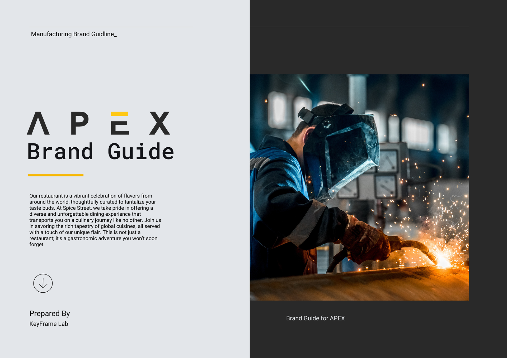
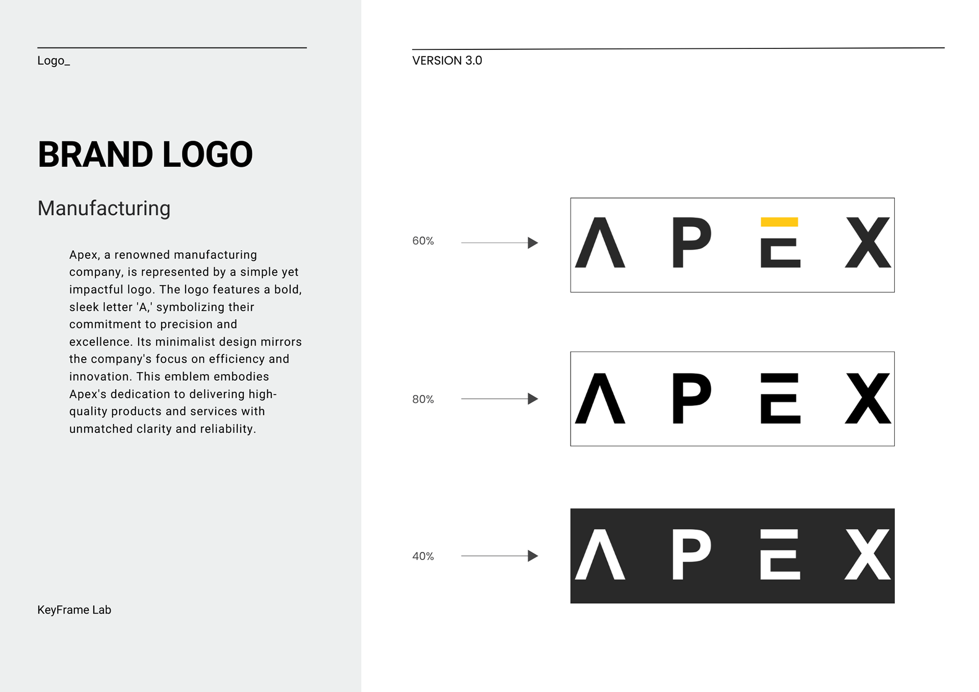
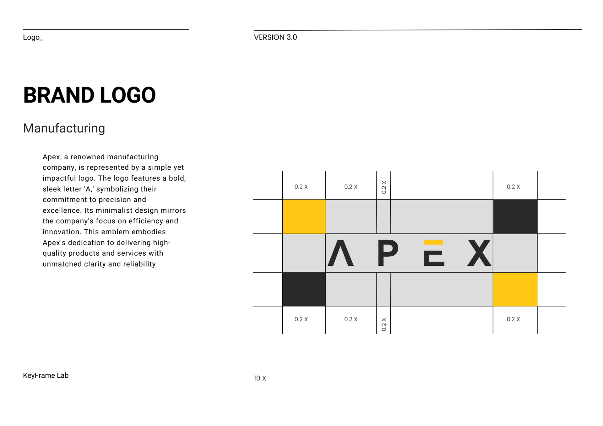
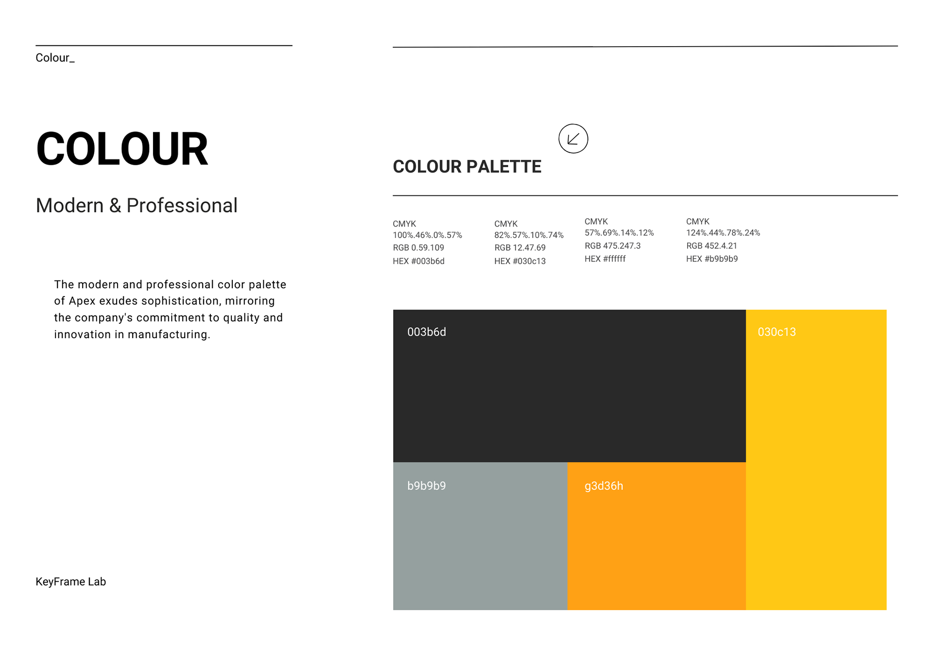
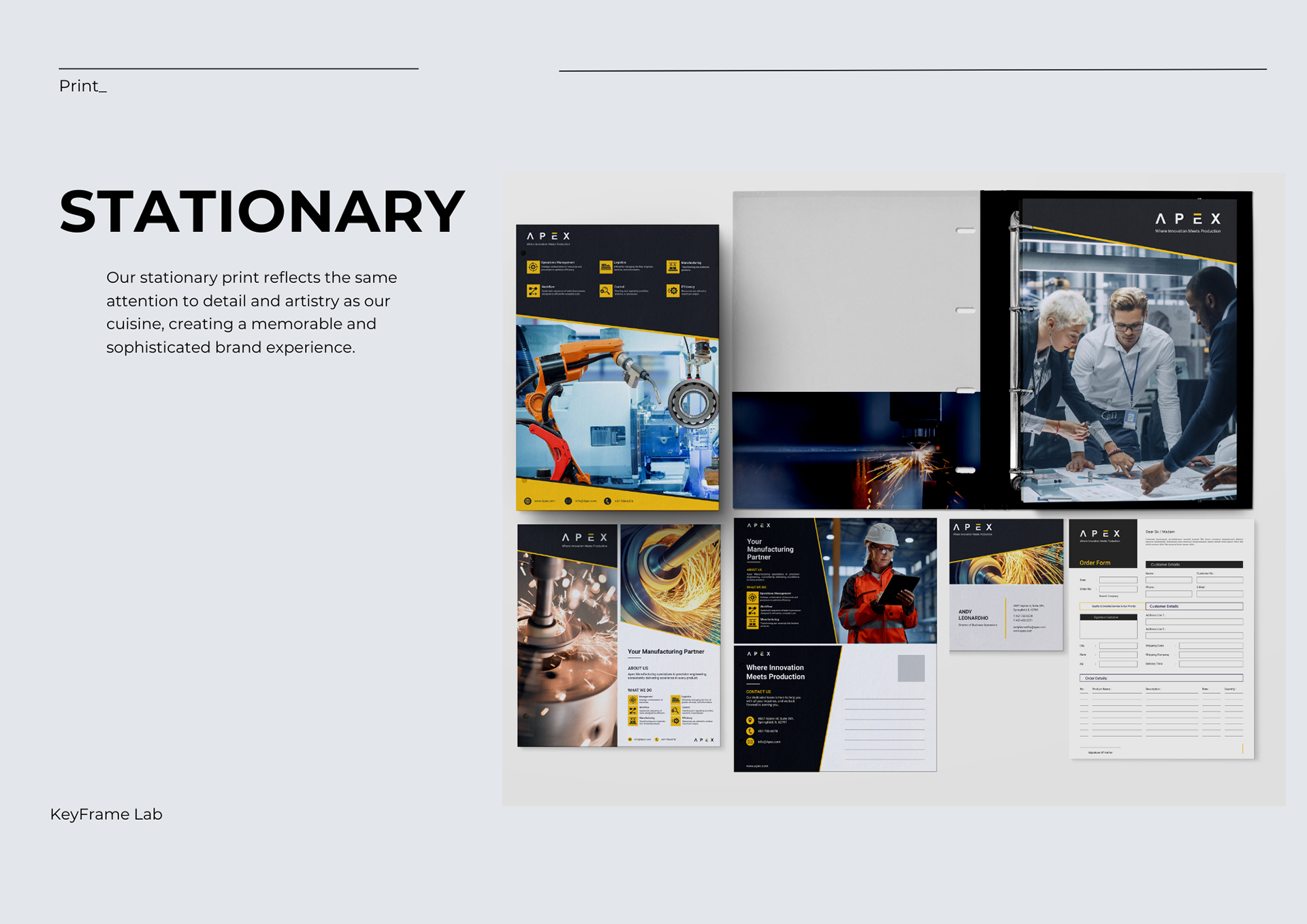
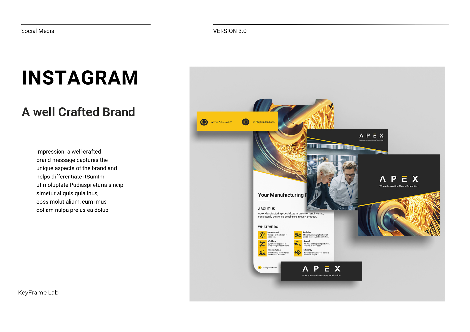
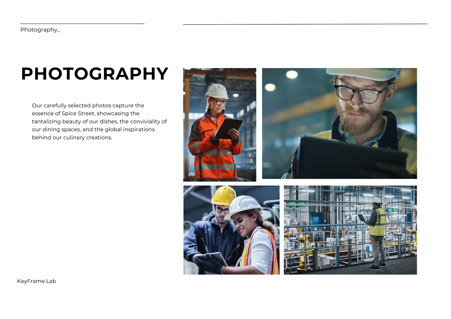
At the heart of APEX, a fictional manufacturing company, lies a brand design curated to embody innovation and precision. A striking yellow and grey color palette sets the tone for a visual identity that balances vibrancy with professionalism. The sleek photos seamlessly integrate industrial equipment, factory settings, and the dedicated individuals behind the scenes, striking a harmonious chord between technological advancement and the human touch.
Cityscape Realty Group:
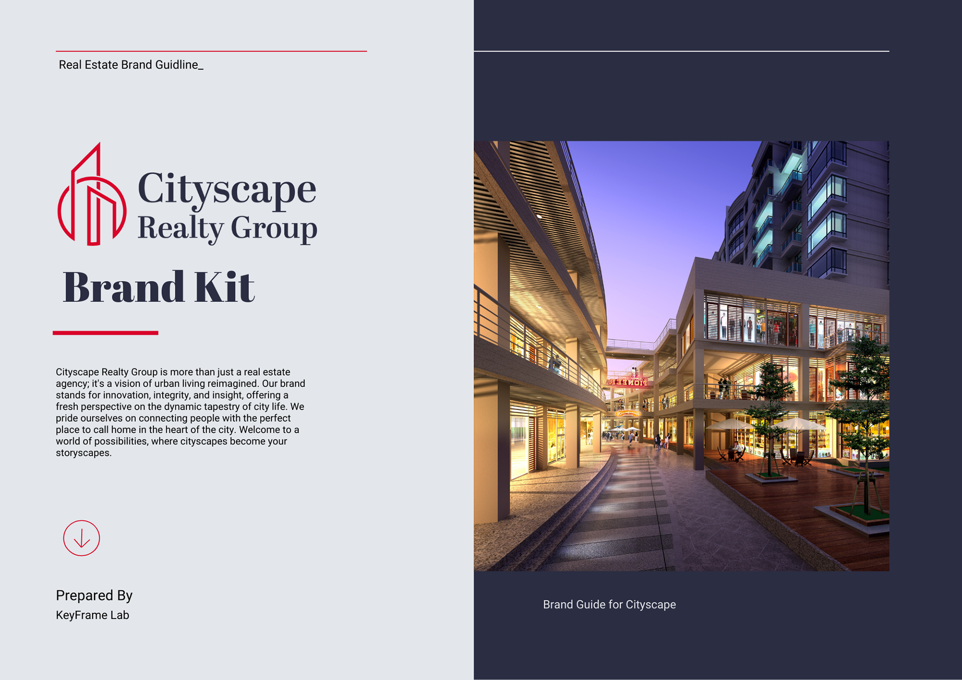
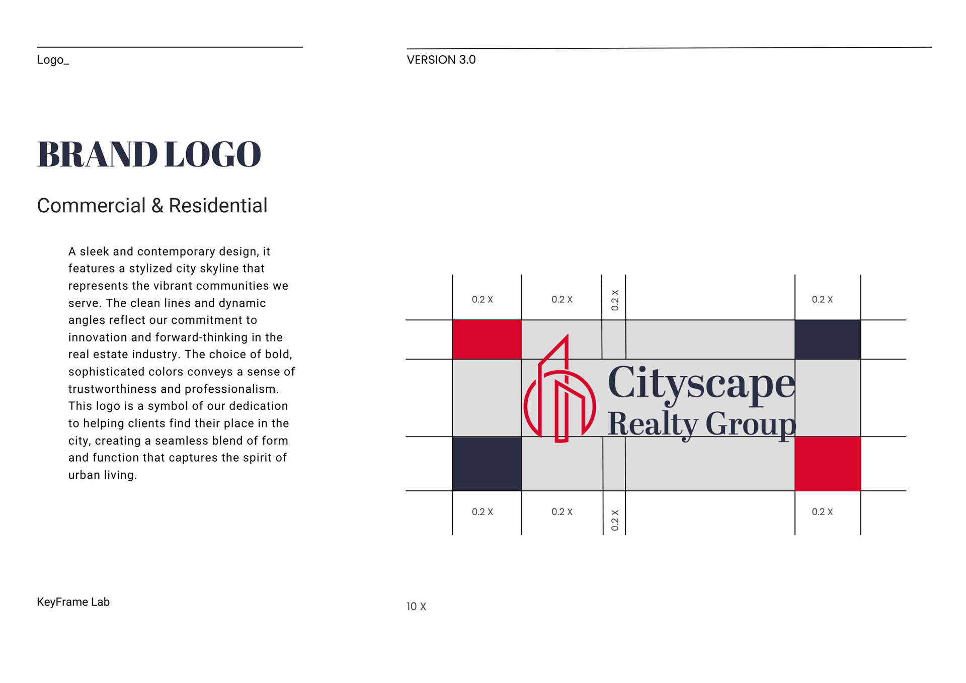
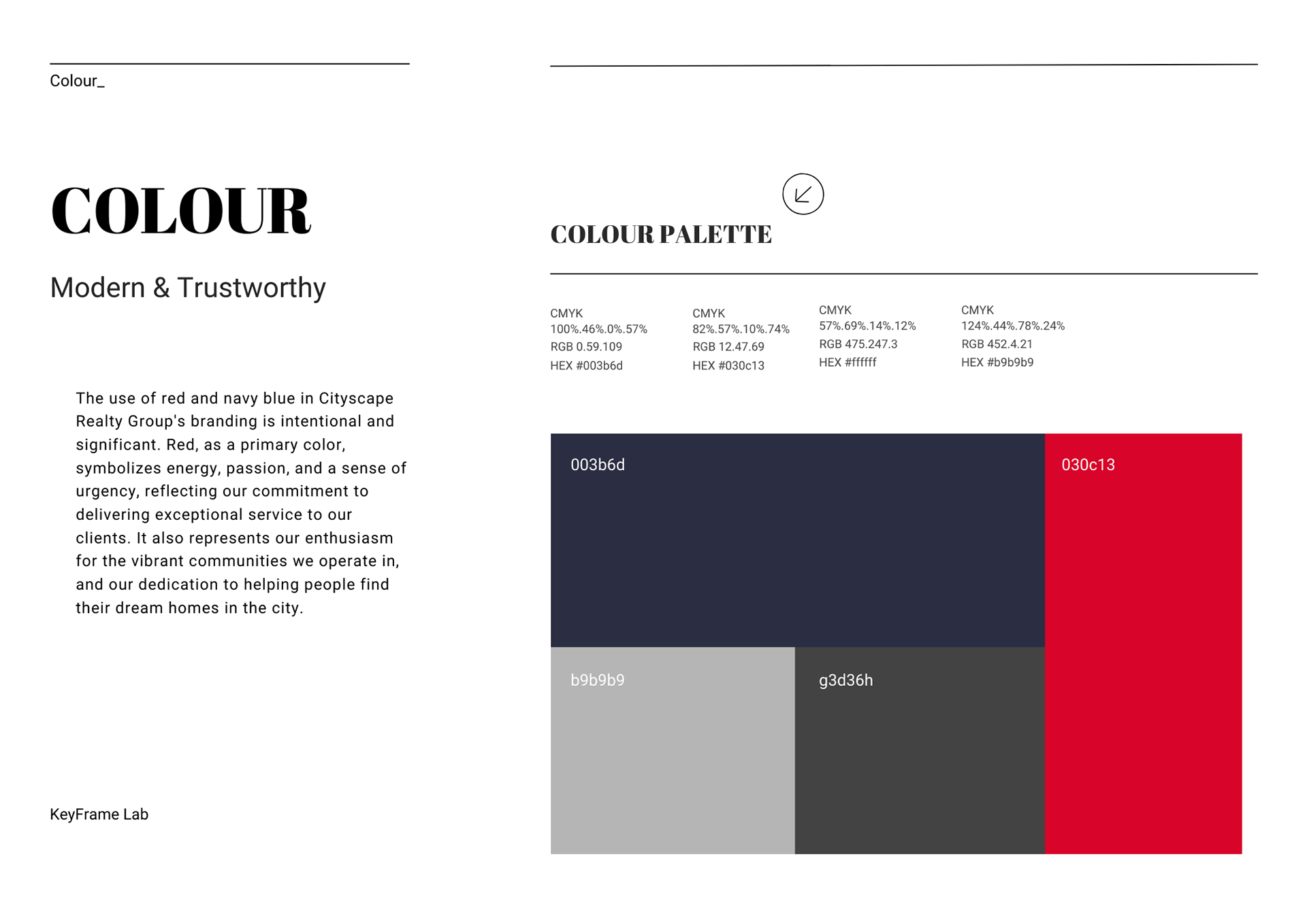
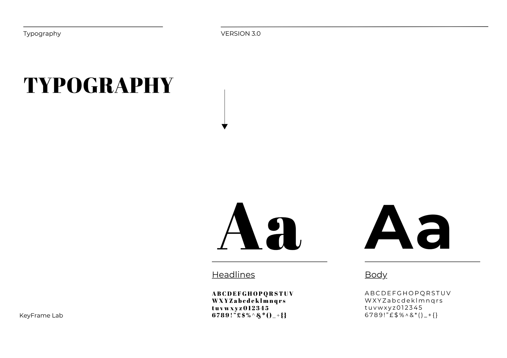
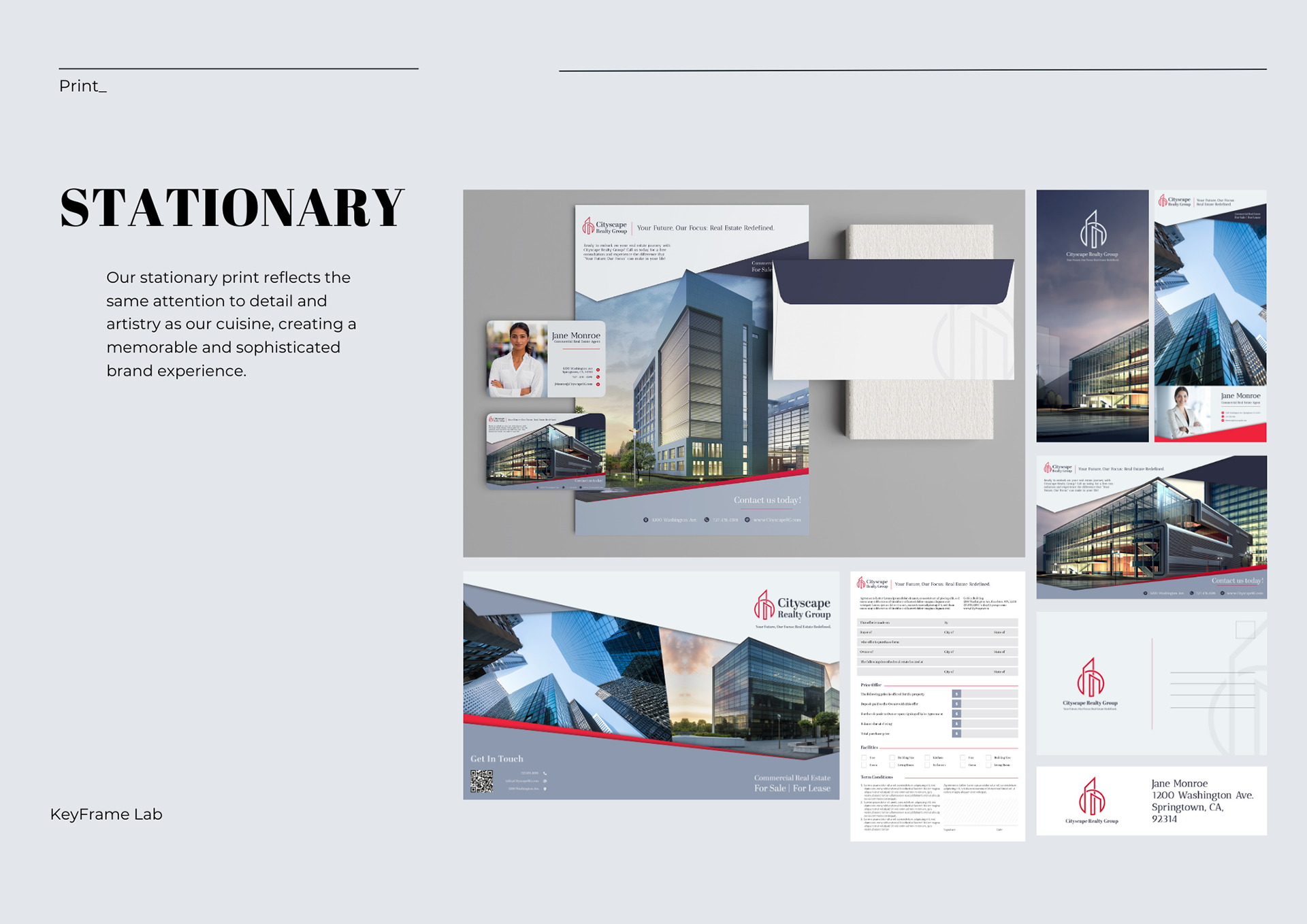
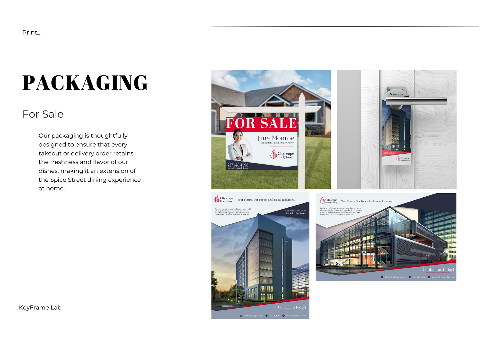
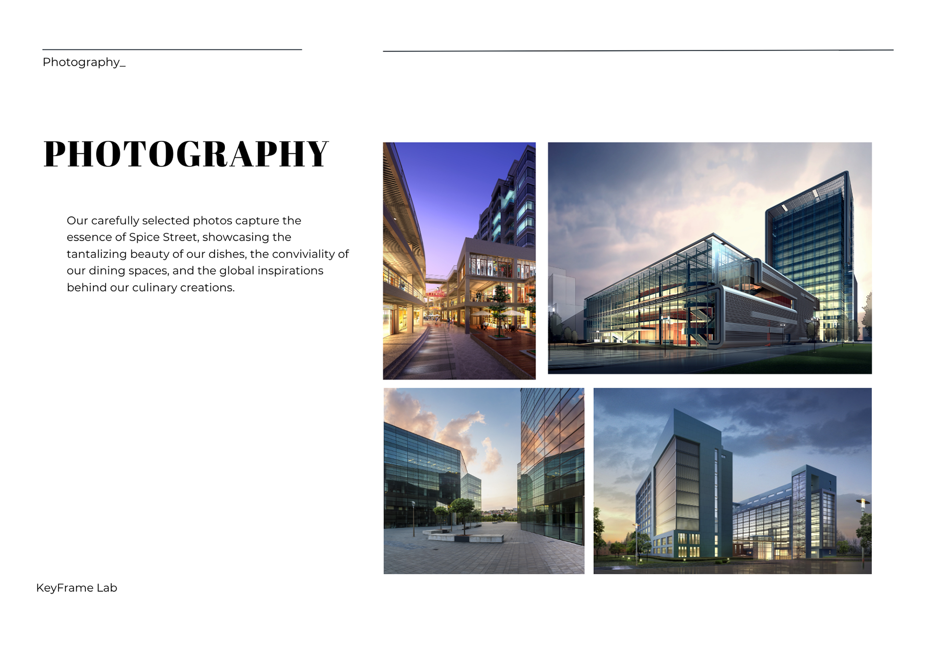

Cityscape Realty Group uses a rich palette of red and dark blue, colors that exude authority and trust. This brand design not only serves as a visual beacon of reliability but also immerses clients in the architectural allure of potential spaces.
Property Capital Management Bank:



For this financial institution, I aimed to weave a narrative of trust and financial acumen. The use of harmonious green hues not only aligns with themes of prosperity but also instills a sense of reliability.
Healthwell Hospital:
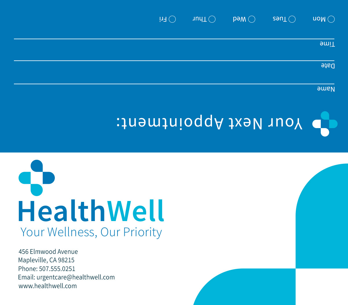

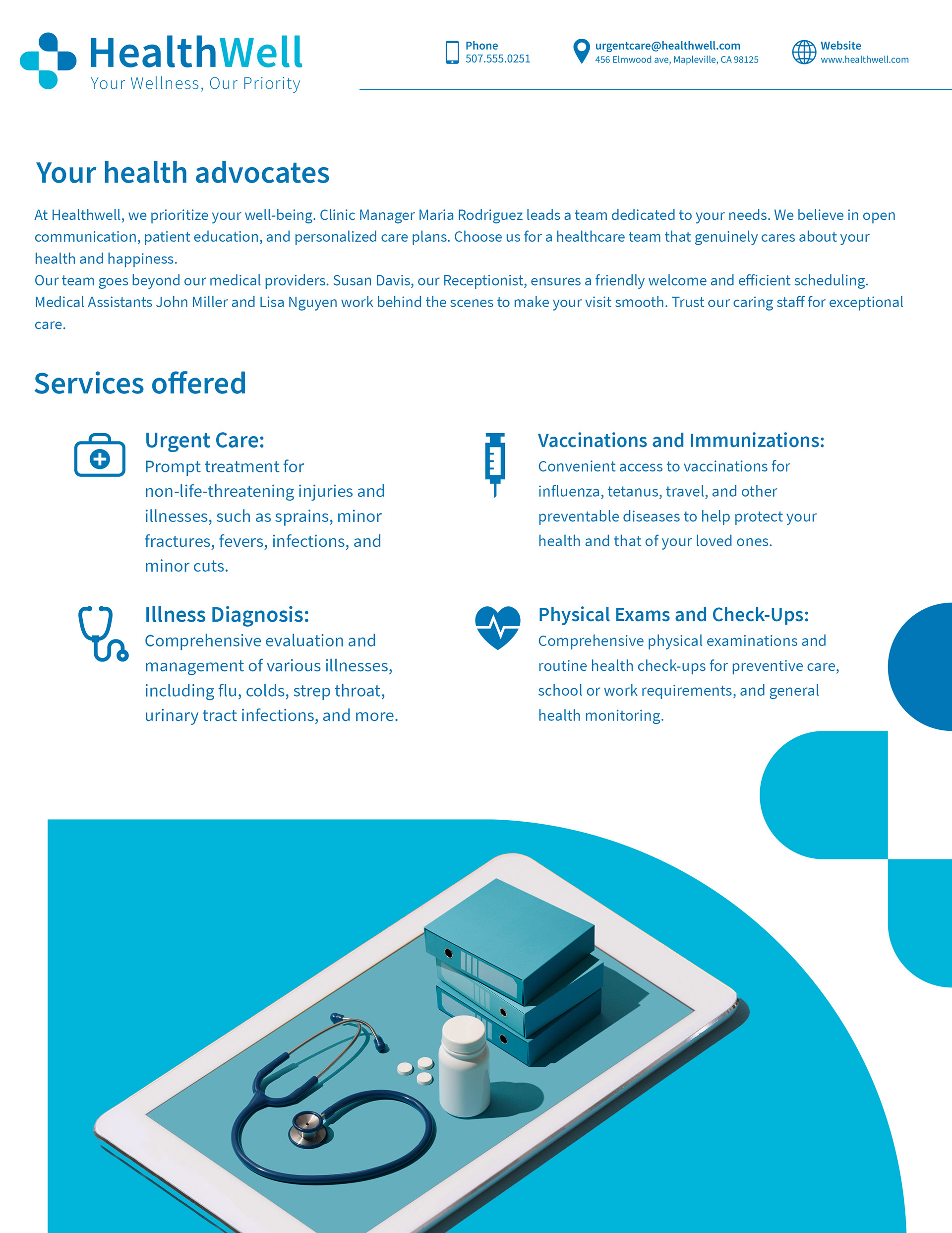


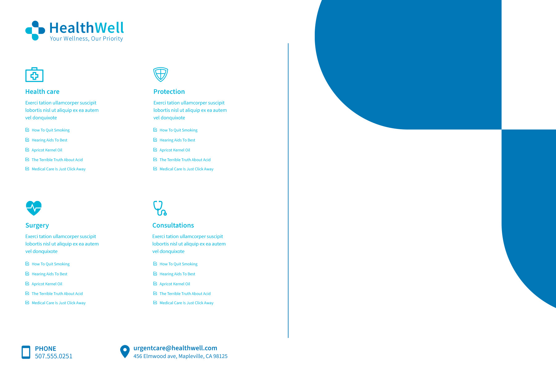

At the core of HealthWell, a fictional private hospital, lies a brand design characterized by a serene and healing ambiance. With a color palette dominated by calming blues and whites, the visual identity aims to evoke a sense of trust, professionalism, and tranquility. From the hospital's logo to its signage and marketing materials, every element is crafted to convey a commitment to healthcare excellence and patient well-being.
Skyline Hotel:
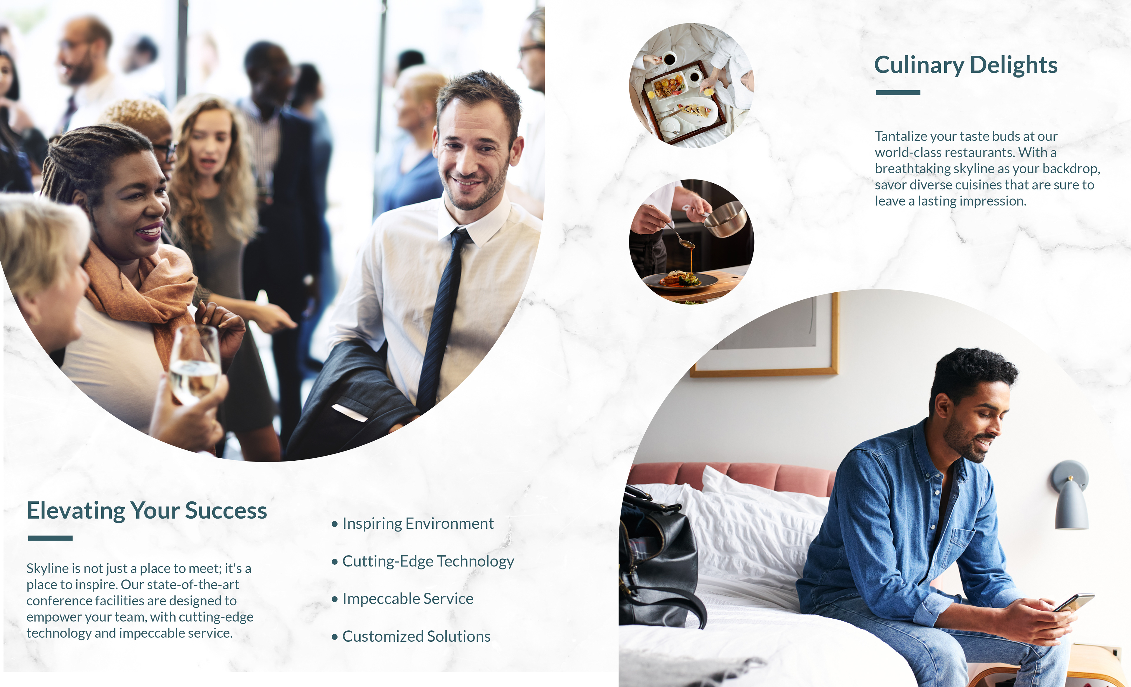
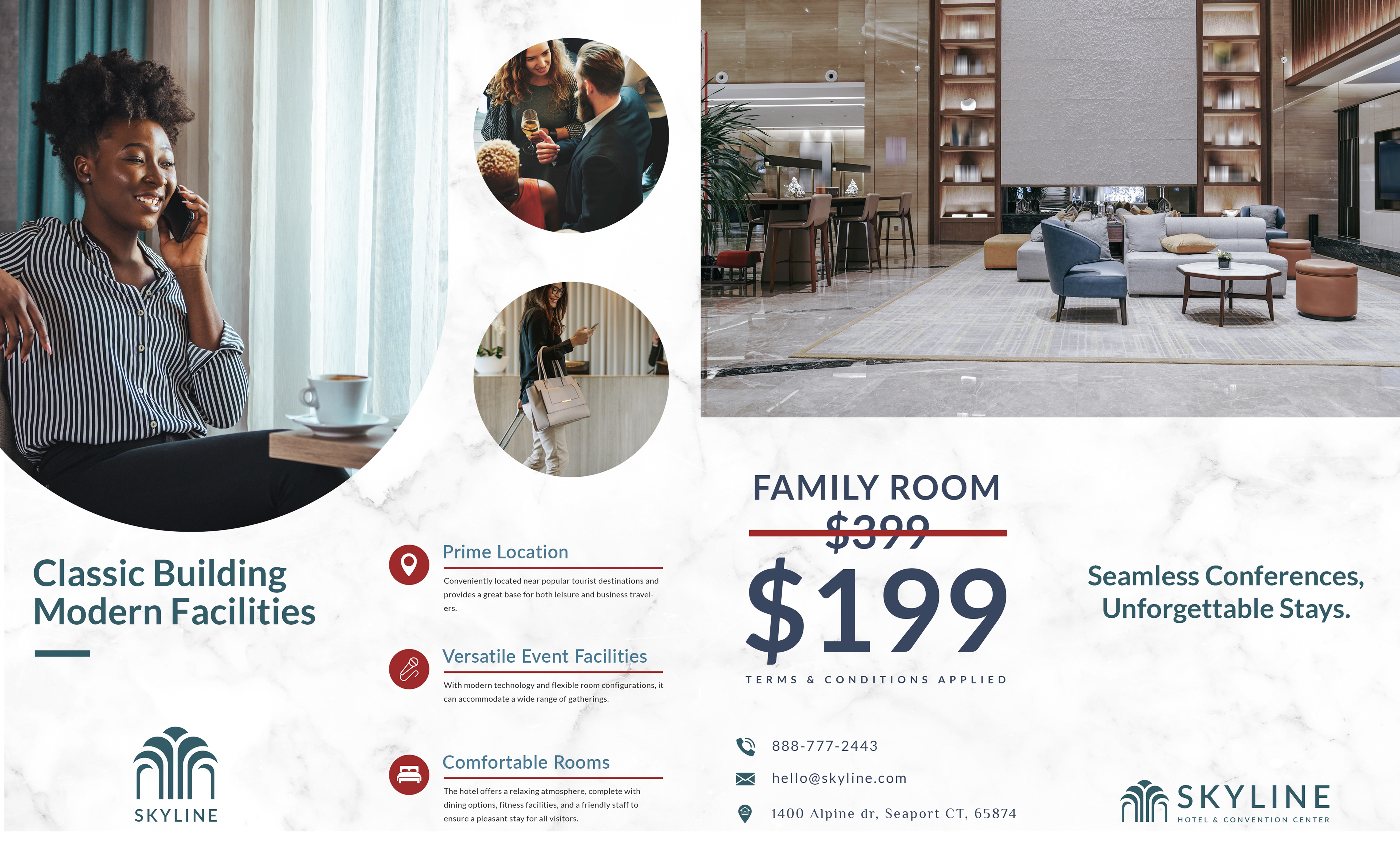
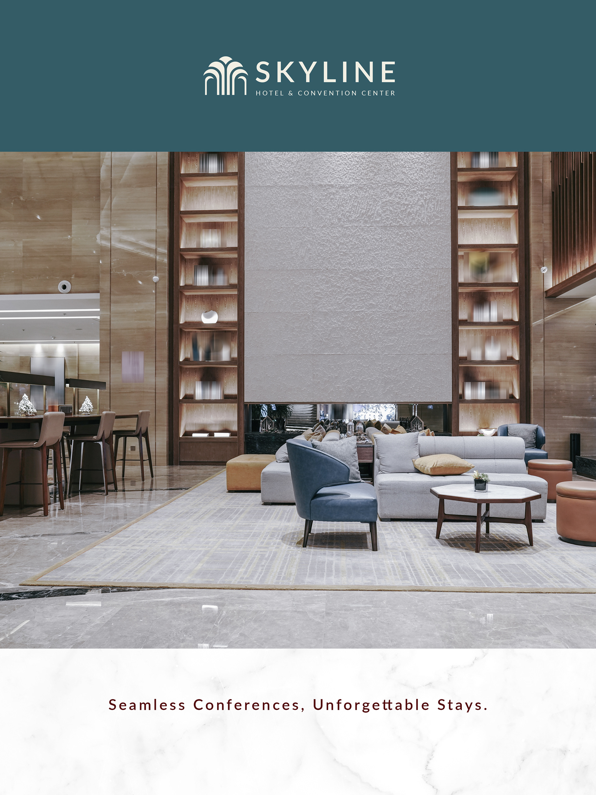
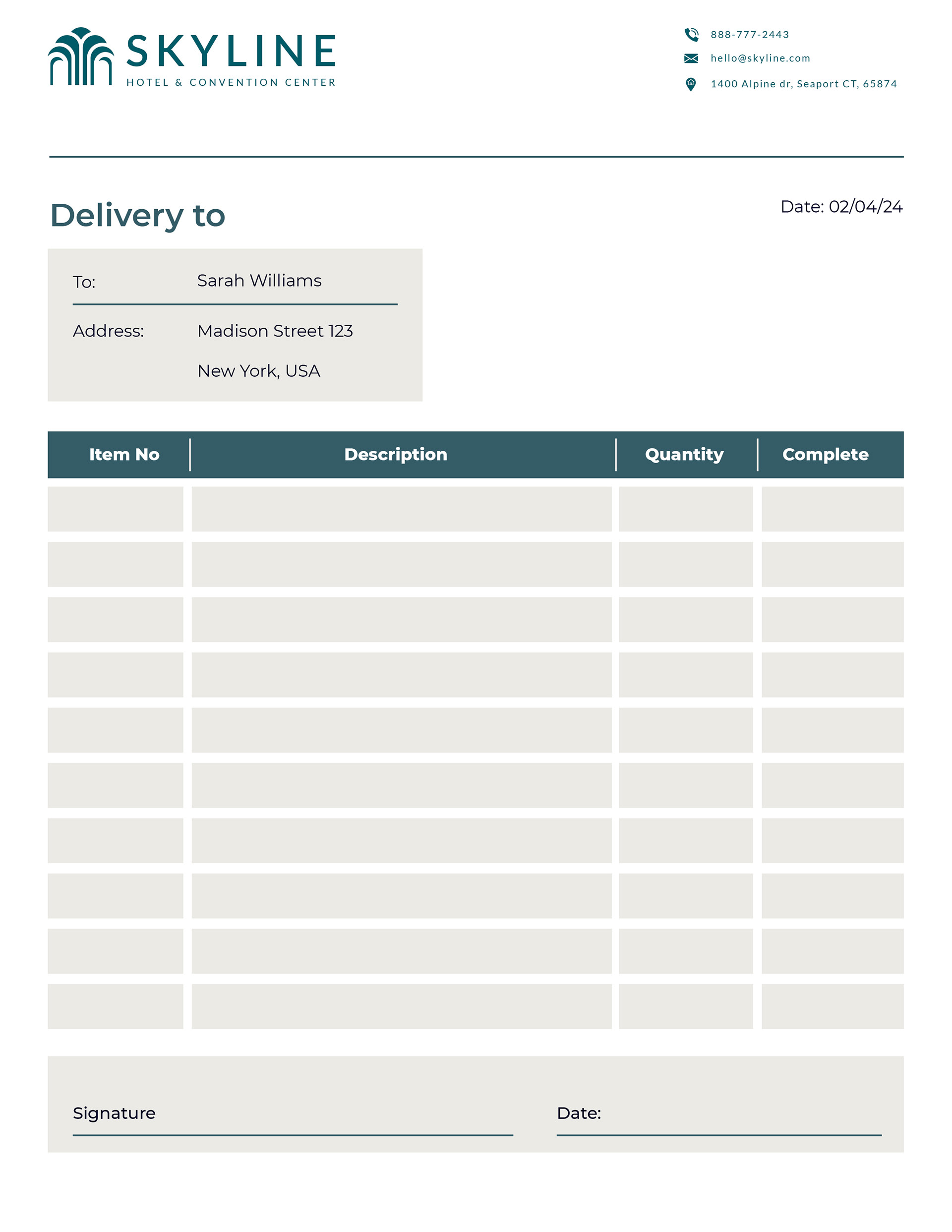

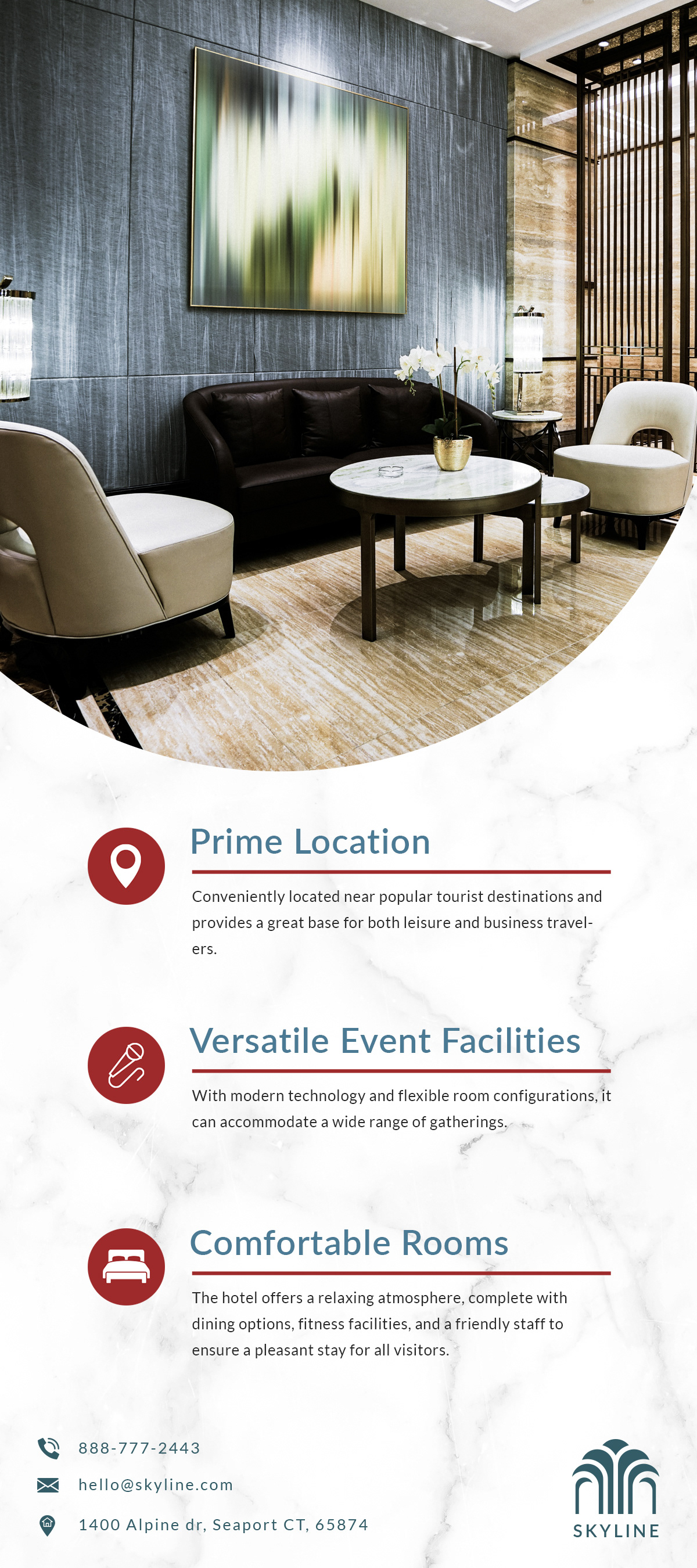
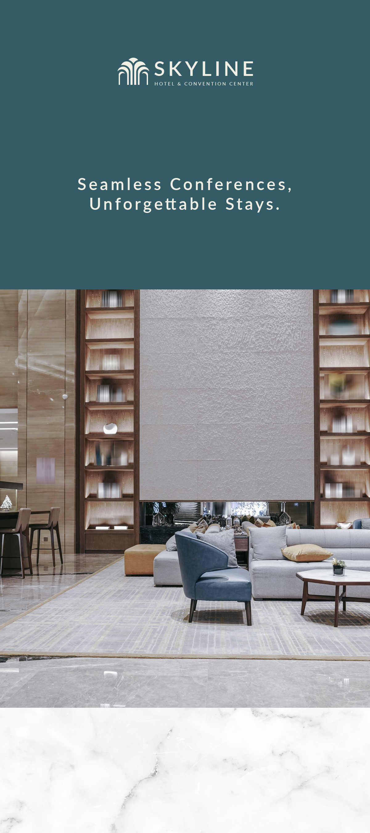
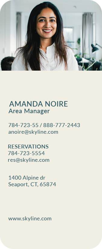
The color palette for Skyline, a fictional hotel chain, is adorned with white marble, teal, light beige, and maroon accents. It sets the stage for a harmonious blend of luxury and warmth. The sleek photography, featuring business casual guests and high-end hotel imagery, serves as a visual narrative, inviting patrons into a world where leisure seamlessly intertwines with opulence.
Ascendia Corporate Offices:
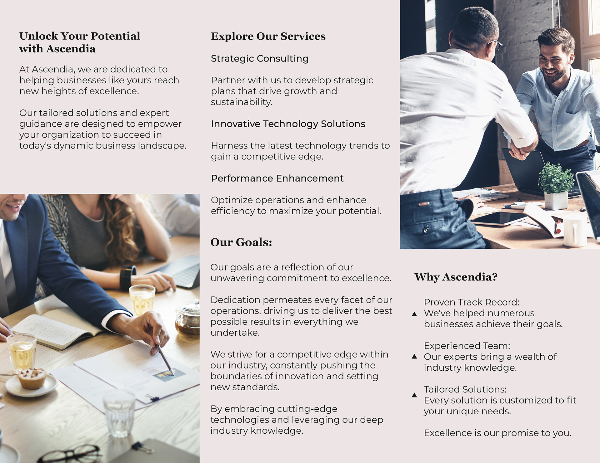


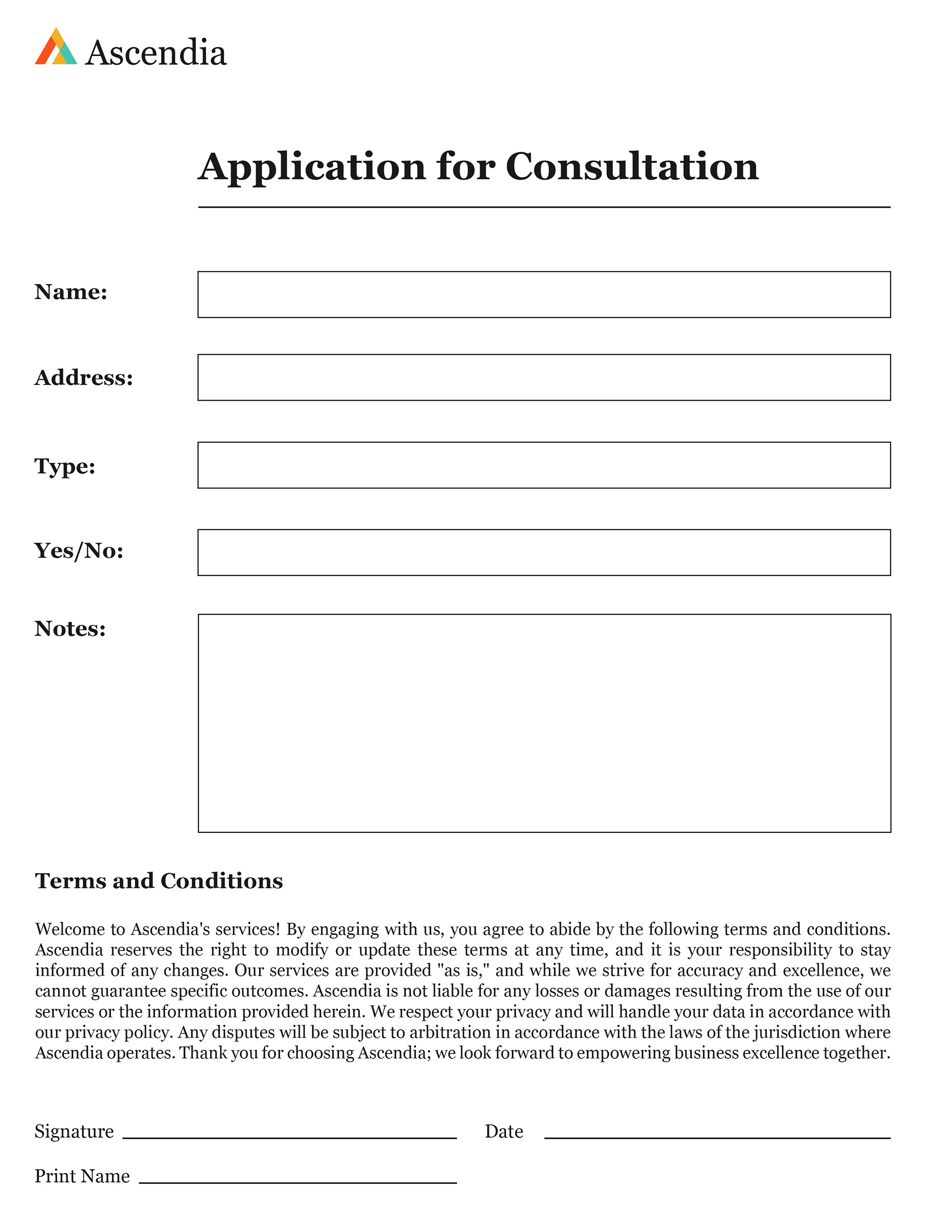

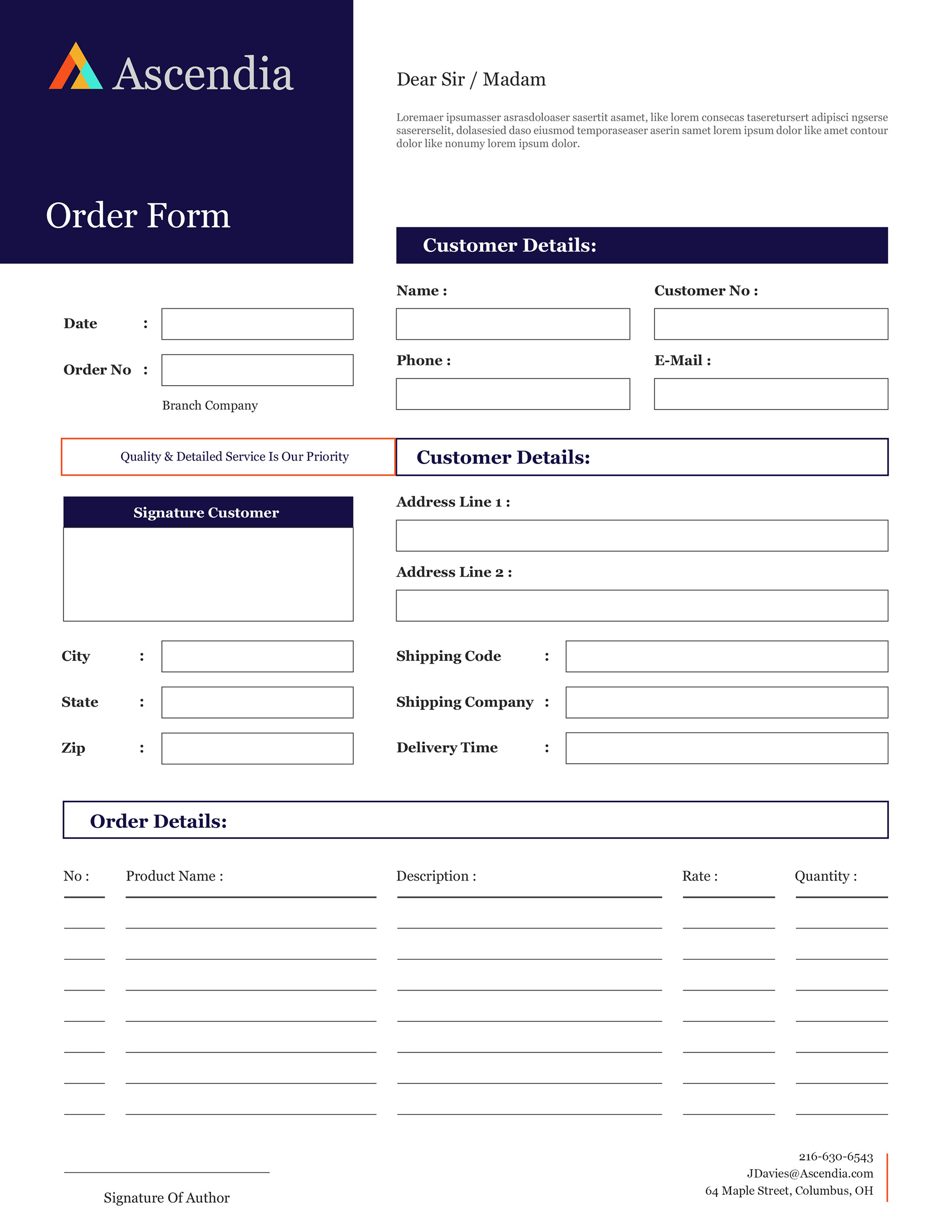



Ascendia, a fake corporate company, is designed to thrive on the dynamic interplay of bold colors and sleek graphics. At the heart of this design are sleek line drawings that form the distinctive logo, serving as visual anchors throughout all print materials. These graphic elements not only convey a sense of modernity but also encapsulate the company's ethos of progress and creativity.
